Angular Material Tooltip: mat Tooltip example
To add tooltips in Angular we can use angular material tooltip module called MatTooltipModule.
matTooltip selector is used to display the tooltip when the user hovers over an element or longpresses an elements in mobile devices.
Tooltips in Angular
Steps to add tooltips in Angular applications.
step 1: Import Angular material tooltip module
We can import tooltip module (MatTooltipModule) in our components ts file or app.module.ts file or some common material module which can be used across the application as explained in angular material tutorial.
import {MatTooltipModule} from '@angular/material';
step 2: Use mat Tooltip selector to display tooltips
After importing MatTooltipModule in our component file, we can use mat Tooltip selector to add tooltip texts as shown below.
<button mat-raised-button
        matTooltip="Tooltips in Angular">
  Tooltip
</button>
In the above code I am adding tooltip to a button element.
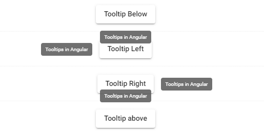
step 3: Set the mat tooltip Position using matTooltipPosition
By default tooltip is displayed below the element.
we can change the tooltip position by using matTooltipPosition input property.
mat Tooltip above
To display tooltip above the element set the matTooltipPosition property as above
<button mat-raised-button
        matTooltip="Tooltip above the element"
        matTooltipPosition="after">
  Tooltip
</button>
mat Tooltip below
Default behavior.
Tooltip always displayed below the element
<button mat-raised-button
        matTooltip="Tooltip below the element"
        matTooltipPosition="below">
  Tooltip
</button>
mat Tooltip left
To display tooltip on the left side of element we can set property to “left” as shown below.
<button mat-raised-button
        matTooltip="Tooltip on the left side of  the element"
        matTooltipPosition="left">
  Tooltip
</button>
If there is no enough space to display tooltip on the left side, then it will be displayed on the right side of element.
mat Tooltip right
To display tooltip on the right side of element we can set property to “right” as shown below.
<button mat-raised-button
        matTooltip="Tooltip on the right side of  the element"
        matTooltipPosition="right">
  Tooltip
</button>
If there is no enough space to display tooltip on the right side, then it will be displayed on the left side of element.
matTooltip Position
Angular tooltips in RTL websites
If you are developing RTL (Right To Left) websites, and to display tooltips on the left side or right of the HTML elements we have to use “before” and “after” instead of “left” or “right”.
mat Tooltip before
In RTL website layouts,below code displays the tooltip on the left side of the element.
<button mat-raised-button
        matTooltip="Tooltip before the element"
        matTooltipPosition="before">
  Tooltip
</button>
mat Tooltip after
If you set matTooltipPosition property to “after”, the tooltip will be displayed after the element in RTL websites.
<button mat-raised-button
        matTooltip="Tooltip on the right side of  the element"
        matTooltipPosition="after">
  Tooltip
</button>
Disable mat tooltip in Angular using matTooltipDisabled
matTooltipDisabled is used to disable tooltips in Angular.
<button mat-raised-button
        matTooltip="Disable tooltip"
        matTooltipDisabled="true">
Disable tooltip
</button>
We can dynamically change the [matTooltipDisabled] input property by binding to a variable.
So depending upon the usage we can disable or enable tooltip from showing.
<button mat-raised-button
        matTooltip="Disable tooltip"
        [matTooltipDisabled]="isDisabled">
Disable tooltip
</button>
Adding delay before showing or hiding the tooltip
Generally, the tooltip will be displayed immediately when the user’s mouse hovers over the element and hides immediately when the user’s mouse leaves.
In mobile devices, the tooltip is displayed when the user longpresses the tooltip’s trigger element and it will hide after a delay.
The default tooltip hide delay is 1500ms.
To add a delay before showing or hiding the tooltip, we can use matTooltipShowDelay and matTooltipHideDelay input properties.
The two properties accepts delay time in milliseconds.
matTooltipShowDelay And matTooltipHideDelay example
Now we will learn how to add delay before showing or hiding the tooltip with an example.
<!--Input to add a delay between hovering over
the element and displaying the tooltip-->
<mat-form-field>
  <input matInput placeholder="Show delay in milliseconds)"
         type="number"
         [formControl]="showDelay">
</mat-form-field>

<!--Input to add a delay between hovering away
from the element and hiding the tooltip-->

<mat-form-field>
  <input matInput placeholder="Hide delay in milliseconds"
         type="number"
         [formControl]="hideDelay">
</mat-form-field>

<!--Element that displays a tooltip
with a custom delay in showing and hiding-->
<button mat-raised-button
        matTooltip="Info about the action"
        [matTooltipShowDelay]="showDelay.value"
        [matTooltipHideDelay]="hideDelay.value">
  Action
</button>
And in our component ts file we can assign some default values to showDelay and hideDelay form elements as shown below.
@Component({
  selector: 'app-tooltip-delay-example',
  templateUrl: 'app-tooltip-delay-example.html',
  styleUrls: ['app-tooltip-delay-example.css'],
})
export class TooltipDelayExample implements OnInit {

  showDelay = new FormControl(2000);
  hideDelay = new FormControl(3000);
  constructor() { }
  ngOnInit() {}

}
Change the Styles of mat Tooltip
We can change the style of angular material tooltip by adding a class to the mat Tooltip.
Adding a class to mat tooltip container using matTooltipClass
We can give custom class to tooltip container using matTooltipClass.It has similar syntax as ngClass.
This is very useful incase if we want to style our tooltip like changing the background color of tooltip container, increase or decrease font size of tooltip or adding a line break to the tooltip text etc.
<button mat-raised-button
        matTooltip="Adding a class to the tooltip container"
        matTooltipClass="custom-tooltip">
  Custom tooltip
</button>
And in our component’s style.css file we can override the existing tooltip styles by using matTooltipClass value.
.custom-tooltip {

}
After adding class to the tooltip container we need to remove view encapsulation so that the custom tooltip style defined in component’s style css(tooltip.component.scss) file will not be scoped to this component’s view.
import { Component, OnInit, ViewEncapsulation } from '@angular/core';

@Component({
  selector: 'app-tooltip',
  templateUrl: './tooltip.component.html',
  styleUrls: ['./tooltip.component.scss'],
  encapsulation: ViewEncapsulation.None
})
export class TooltipComponent implements OnInit {

  constructor() { }

  ngOnInit() {
  }

}
Change font size of Angular Material Tooltip
Now after adding class to the tooltip container, we can define our own styles to the tooltip container.
To change the font size of tooltip add font-size css to the tooltip class as shown below.
.custom-tooltip {
   font-size:25px;
}
If font size is not changing then please cross check whether you have added encapsulation: ViewEncapsulation.None to the component declaration.
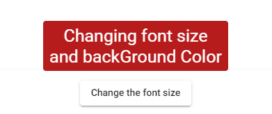
Change the font size mattooltip
Adding multiline tooltip using mat Tooltip
To add a multiline mat Tooltip follow the below steps
- Add a custom class to the mat Tooltip
- Add
white-space: pre-line;css to the class - Add new line character(\n)
in the mat Tooltip content.
Add a component called MultilineTooltipComponent in your project file by using below command ng generate component multiline-tooltip.
import { Component, OnInit, ViewEncapsulation } from '@angular/core';

@Component({
  selector: 'app-multiline-tooltip',
  templateUrl: './multiline-tooltip.component.html',
  styleUrls: ['./multiline-tooltip.component.scss'],
  encapsulation: ViewEncapsulation.None
})
export class MultilineTooltipComponent implements OnInit {

  constructor() { }

  ngOnInit() {
  }

}
And in component html file we will add a multiline tooltip to a button element as shown below.
<button mat-raised-button
matTooltip="Multiline Tooltip This is second line"
matTooltipClass="multiline-tooltip">
Multiline tooltip
</button>
In mat Tooltip content, I have added new line character ( ).
And finally add white-space: pre-line css to the custom class.
.multiline-tooltip{
  white-space: pre-line;
}
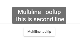
multiline mattooltip
Show Angular Material Tooltip Conditionally.
We can use matTooltipDisabled property to show tooltip conditionally as shown below.
<button mat-raised-button
        matTooltip="Tooltip conditionally"
        [matTooltipDisabled]="isHidden()">
Conditional Tooltip
</button>
We can bind a variable or we can pass a function to [matTooltipDisabled] to toggle the visibilty of material tooltip.
Instead of that we can pass an expression to [matTooltip] to display or hide the tooltip as shown below.
<button mat-raised-button
        [matTooltip]="!isHidden() ? 'Tooltip' : ''">
Conditional Tooltip
</button>
Add tooltip to a disabled button in Angular
The angular material tooltip will be triggered on the mouseenter event and it doesn’t get fired by most browsers for disabled elements. So tooltip will not be displayed for disabled elements.
And sometimes we want to communicate to the user, why an element is disabled?
Tooltip can be very useful in such cases.
To add a tooltip to a disabled button, we can add matTooltip to a parent element as shown below.
<div matTooltip="You do not have permission to delete"
     [matTooltipDisabled]="!isButtonDisabled()">
    <button mat-raised-button
            [disabled]="isButtonDisabled()">
            Delete
    </button>
</div>
In the above code I am using matTooltipDisabled input property to enable tooltip only when button is disabled.
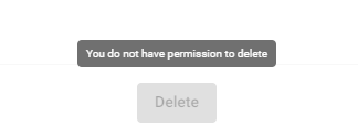
add tooltip to disabled button
Manually Trigger the tooltip in Angular
Angular Material tooltip module API have three methods which will be used to display or hide tooltip manually.
- show
- hide
- toggle
mat Tooltip show
mat Tooltip show method accepts the show tooltip delay as a parameter.
delay will be in milli seconds if there is no parameter passed then delay will 0ms or defaults to tooltip-delay-show.
mat Tooltip hide
mat Tooltip hide method accepts the hide tooltip delay as a parameter.
delay will be in milli seconds if there is no parameter passed then delay will 0ms or defaults to tooltip-delay-hide.
mat Tooltip toggle
Used to toggle the tooltip
We will understand these methods further using a simple example.
Add mat Tooltip to the host element. and then add a template reference(#tooltip) to matTooltip as shown below.
    <button mat-raised-button #tooltip="matTooltip"
            matTooltip="Manually triggered tooltip">
             Manual Tooltip
    </button>
And further we can use the template reference variable to show or hide the tooltip on a button click event as shown below.
<mat-card>

    <button mat-raised-button #tooltip="matTooltip"
            matTooltip="Manually triggered tooltip">
             Manual Tooltip
    </button>


    <button mat-button
            (click)="tooltip.show()">
      show
    </button>
    <button mat-button
            (click)="tooltip.hide()">
      hide
    </button>
    <button mat-button
            (click)="tooltip.toggle()">
      toggle
    </button>

    </mat-card>
In the above example we are using template reference (#tooltip) in the HTML file itself.
And if you want to trigger the tooltip manually from component ts file we can use the ViewChild decorator.
export class TooltipComponent implements OnInit {

  constructor() { }

  @ViewChild('tooltip') manualTooltip: MatTooltip;


  ngOnInit() {
  }

  showTooltip(){
    this.manualTooltip.show();
  }

  hideTooltip(){
    this.manualTooltip.hide();
  }

  toggleTooltip(){
    this.manualTooltip.toggle();
  }

}
And we can refactor the above template html file to use the methods in component ts files as shown below.
<button mat-button
    (click)="showTooltip()">
show
</button>

<button mat-button
    (click)="hideTooltip()">
hide
</button>

<button mat-button
    (click)="toggleTooltip()">
toggle
</button>

<button mat-raised-button #tooltip="matTooltip"
    matTooltip="Manually triggered tooltip">
    Manual Tooltip
</button>
Change the mat tooltip content dynamically in Angular
To change the tooltip content dynamically we can bind a variable or pass a method to
matTooltip selector.
And use [matTooltip] instead of matTooltip while binding the content.
<button mat-raised-button
    [matTooltip]="getTooltipContent()">
    Manual Tooltip
</button>

or

<button mat-raised-button
    [matTooltip]="tooltipContent">
    Manual Tooltip
</button>


export class TooltipComponent implements OnInit {

  tooltipContent : string;
  constructor() {
    this.tooltipContent = "defaultMessage"
  }

  getTooltipContent(){
    this.tooltipContent = "Changing tooltip Content".
  }

}
mat Tooltip not working
Angular material tooltip module depends upon BrowserAnimationsModule. Other wise matTooltip will not be displayed
To use mat Tooltip we need to add BrowserAnimationsModule in app.module.ts file
import { BrowserAnimationsModule }
from '@angular/platform-browser/animations';
And also remember to add MatTooltipModule as mentioned in step 1.
If you are not installed and imported HammerJs you may need to add it as material uses hammerjs for some animations and touch gestures
npm i -S hammerjs
npm i -D @types/hammerjs
Import hammerjs in app.module.ts
import 'hammerjs';