mat-radio-button, Angular material radio button Usage, Example
Learn how to add radio buttons using material component
<mat-radio-button> selector is an Angular material radio box component.
It is similar to native <input type="radio"> element & sugar coated with Material design styling and animations.
Steps to add mat-radio-button in Angular applications
Follow the below Steps to add mat-radio-button in Angular.
Step 1: Import MatRadioModule
<mat-radio-button> part of Angular Material module called MatRadioModule.
To use <mat-radio-button> we have to import MatRadioModule from @angular/material module.
We can import MatRadioModule in our components .ts file or app.module.ts file or some common material module which can be used across the application as explained in angular material tutorial.
import {MatRadioModule} from '@angular/material/radio';
Step 2: Use mat-radio-group selector to group radio buttons.
Radio buttons are generally used in radio groups i.e, collections of radio buttons indicating a set of related options.
Only one radio button in a given group can be selected at the same time.
In Angular, To group radio buttons we should enclose them inside mat-radio-group selector.
<mat-radio-group aria-label="Select an option">
  <mat-radio-button value="1">Option 1</mat-radio-button>
  <mat-radio-button value="2">Option 2</mat-radio-button>
</mat-radio-group>
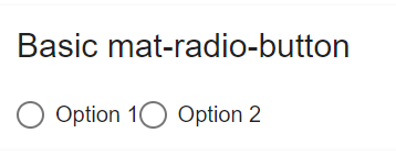
mat-radio-button Example
Now we will go though an example to understand further.
ng generate component AngularMaterialRadioButton
And add following code in generated angular-material-radio-button.component.html file
<mat-radio-group aria-label="Select an option">
  <mat-radio-button value="1">Option 1</mat-radio-button>
  <mat-radio-button value="2">Option 2</mat-radio-button>
</mat-radio-group>
Now we will use the component, by adding it in app.component.html file
<app-angular-material-radio-button></app-angular-material-radio-button>
mat-radio-button example
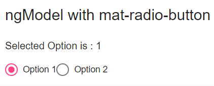
Bind data to mat-radio-button using NgModel
Using ngModel we can bind the data to the mat-radio-button group elements.
<div>Selected Option is : {{ selectedOption }}</div>
<mat-radio-group aria-label="Select an option" [(ngModel)]="selectedOption">
    <mat-radio-button value="1">Option 1</mat-radio-button>
    <mat-radio-button value="2">Option 2</mat-radio-button>
</mat-radio-group>
Added a variable called selectedOption and used ngModel to bind the data to mat-radio-group selector.
mat-radio-button ngModel
Using *ngFor to populate mat-radio-button options
In real world applications, radio buttons options will be dynamic and might be coming from the server.
So we will use *ngFor directive to populate radio button options.
I have created two variables called fruits and favoriteFruit.
favoriteFruit is the value of the radio group elements.
export class AngularMaterialRadioButtonComponent implements OnInit {
  constructor() {}

  ngOnInit() {}

  favoriteFruit: string;
  fruits: string[] = ['Apple', 'Banana', 'Mango', 'Guava'];
}
fruits array used to generated mat-radio-button options using *ngFor directive.
<mat-card>
  <label id="example-radio-group-label">Pick your favorite fruit</label>
  <mat-radio-group
    aria-labelledby="example-radio-group-label"
    class="example-radio-group"
    [(ngModel)]="favoriteFruit"
  >
    <mat-radio-button
      class="example-radio-button"
      *ngFor="let fruit of fruits"
      [value]="fruit"
    >
      {{ fruit }}
    </mat-radio-button>
  </mat-radio-group>
  <div>Your favorite fruit is: {{ favoriteFruit }}</div>
</mat-card>
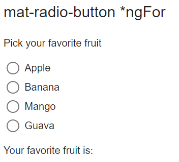
mat-radio-button *ngFor
Now we will go through the properties of mat-radio-button
mat-radio-button Label position
Content of the <mat-radio-button> element acts as label for the radio buttons in Angular material.
Label position can be before or after the radio button.
We can control the label position using labelPosition property of <mat-radio-button>.
<mat-radio-button labelPosition="before">Angular radio button label before
</mat-radio-button>
<mat-radio-button labelPosition="after">Angular radio button label After
</mat-radio-button>
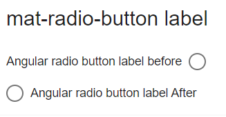
mat-radio-button label
mat-radio-button Checked by default
By default radio buttons are unchecked inside a radio group.
If you want assign some default value to radio group value or if you want to select an option by default use checked property of mat-radio-button
<mat-radio-group aria-label="Select an option">
    <mat-radio-button value="1" checked>Option 1</mat-radio-button>
    <mat-radio-button value="2">Option 2</mat-radio-button>
</mat-radio-group>
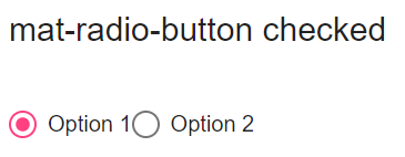
mat-radio-button checked
mat-radio-button disabled
Using disabled property of mat-radio-button we can disable angular material radio button.
<mat-radio-group aria-label="Select an option">
    <mat-radio-button value="1" disabled>Option 1</mat-radio-button>
    <mat-radio-button value="2">Option 2</mat-radio-button>
</mat-radio-group>
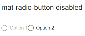
mat-radio-button disabled
mat-radio-group disabled
We can add disabled property to the mat-radio-group to disable all radio button options.
<mat-radio-group aria-label="Select an option" disabled>
    <mat-radio-button value="1">Option 1</mat-radio-button>
    <mat-radio-button value="2">Option 2</mat-radio-button>
</mat-radio-group>
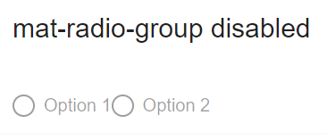
mat-radio-group disabled
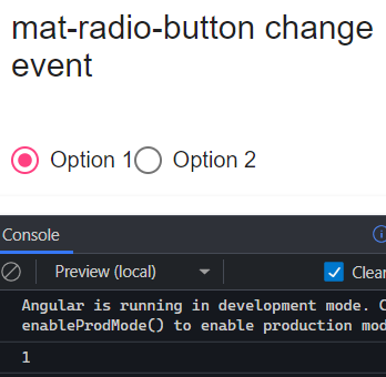
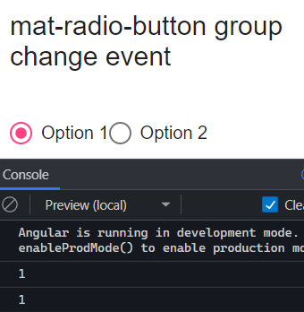
mat-radio-button change event
<mat-radio-button> has a (change) event , which will be triggered when the checked state of radio button changes.
<mat-radio-group aria-label="Select an option">
    <mat-radio-button value="1" (change)="radioButtonChange($event)">
      Option 1
    </mat-radio-button>
    <mat-radio-button value="2" (change)="radioButtonChange($event)">
      Option 2
    </mat-radio-button>
</mat-radio-group>
The (change) event is of type MatRadioChange.
We should import MatRadioChange class from @angular/material/radio.
import { MatRadioChange } from '@angular/material/radio';

radioButtonChange(data: MatRadioChange) {
    console.log(data.value);
}
mat-radio-button change event
The event will be triggered when we click on the radio buttons.
But usually we won’t be adding change event to the radio buttons, we should add change event to the radio group.
mat-radio-group change event
Similar to <mat-radio-button>, mat-radio-group has a (change) event , which will be triggered when the radio group value changes.
It’s also of type MatRadioChange.
  <mat-radio-group
    aria-label="Select an option"
    (change)="radioButtonGroupChange($event)">
    <mat-radio-button value="1">Option 1</mat-radio-button>
    <mat-radio-button value="2">Option 2</mat-radio-button>
  </mat-radio-group>
In the component file
radioButtonGroupChange(data: MatRadioChange) {
    console.log(data.value);
}
One thing you need to understand is, radio button on change event fires only by user interaction.
But if you set the radio button value dynamically, the change event will not be triggered.
mat-radio-group change event
mat-radio-button color and Theming
The color of Angular material radio button can be changed by color property of <mat-radio-button>.
By default value is accent and can be changed to primary or warn according to Material design theming guidelines.
And We can disable ripple animation using Angular Material radio button property disableRipple
<mat-radio-button disableRipple=true>Checkbox Ripple Disabled</mat-radio-button>
mat-radio-button StackBlitz demo
Here is the StackBlitz Demo for mat-radio-button.
https://stackblitz.com/edit/mat-radio-button-example
mat-radio-button is not a known element
<mat-radio-button> is not a known element is a common parse error we will get if we are not configured Angular Material module properly.
Make sure you have added MatRadioModule as mentioned in step 1.
Or add it in common material module as explained in material article