Datepicker in Angular using mat-datepicker | Material Design
To implement date picker in Angular we can use angular material datepicker module called MatDatepickerModule.
Date picker is a component which allow users to choose a date from the calendar pop up or enter a date through text input.
MatDatepickerModule made up of several material components and directives that work together.
Datepicker Angular
Steps to create datepicker in Angular applications.
step 1: Import Angular material datepicker module
We should add MatDatepickerModule in our components ts file or app.module.ts file or some common material module which can be used across the application as explained in angular material tutorial.
import {MatDatepickerModule} from '@angular/material';
step 2: Use matDatepicker selector along with input element
After importing MatDatepickerModule in our component file, use mat-datepicker,mat-datepicker-toggle and input elements together to display datepicker calender pop up.
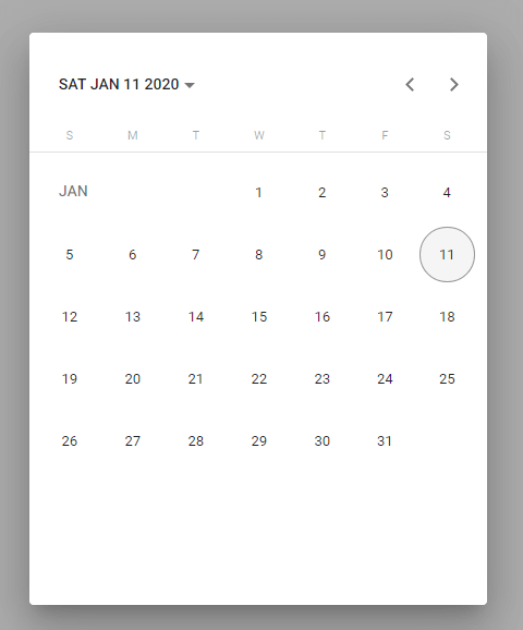
mat-datepicker example
Now we will implement a basic date picker in angular using mat-datepicker element.
- Add a template reference variable
mat-datepickerelement. - Connect
mat-datepickerto input element via[matDatepicker]property. - Finally add date picker toggle button to display or hide calender popup by using
mat-datepicker-toggleelement.
<input [matDatepicker]="basicDatepicker">
<mat-datepicker-toggle [for]="basicDatepicker"></mat-datepicker-toggle>
<mat-datepicker #basicDatepicker></mat-datepicker>
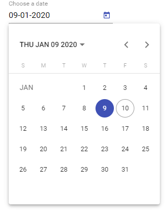
basic datepicker angular
Change the icon of mat-datepicker-toggle
To change the icon of datepicker toggle button use mat-icon along with matDatepickerToggleIcon property inside mat-datepicker-toggle element.
<input [matDatepicker]="basicDatepicker">
<mat-datepicker-toggle [for]="basicDatepicker">
  <mat-icon matDatepickerToggleIcon>
      mouse
  </mat-icon>
</mat-datepicker-toggle>
<mat-datepicker #basicDatepicker></mat-datepicker>
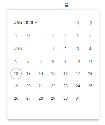
mat-datepicker icon change
mat-datepicker Start View
By default when we open calender pop up it will show the current month calender. Instead of that if we want to set the view to current year we can use startView property of mat-datepicker.
Allowed values of startView are
- month (default)
- year
- multi-year
mat-datepicker startView year
To set the start view to current year (which displays months in the year)set the startView property to year.
<mat-form-field>
    <input matInput [matDatepicker]="pickeryear"
     placeholder="Choose a date">
    <mat-datepicker-toggle  [for]="pickeryear">
    </mat-datepicker-toggle>
    <mat-datepicker #pickeryear startView="year"></mat-datepicker>
</mat-form-field>
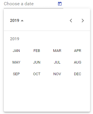
mat-datepicker startview year
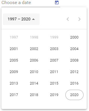
mat-datepicker startView multi-year
Similary we can set the calender pop up view to multi-year to display 24 years.
<mat-form-field>
    <input matInput [matDatepicker]="pickeryear"
    placeholder="Choose a date">
    <mat-datepicker-toggle  [for]="pickeryear">
    </mat-datepicker-toggle>
    <mat-datepicker #pickeryear startView="year"></mat-datepicker>
</mat-form-field>
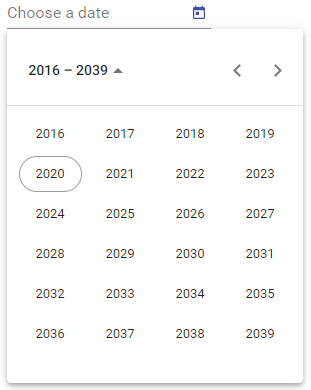
mat-datepicker startview year
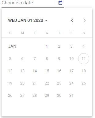
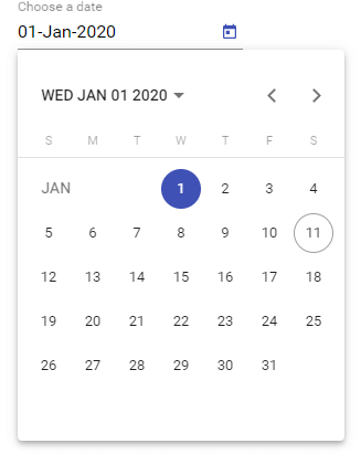
mat-datepicker startAt
By default calender pop up shows the month or year containing today’s date.
To change this behavior we can use startAt property of mat-datepicker.
<mat-form-field>
    <input matInput [matDatepicker]="startatpicker"
     placeholder="Choose a date">
    <mat-datepicker-toggle  [for]="startatpicker">
    </mat-datepicker-toggle>
    <mat-datepicker #startatpicker startView="year"
    [startAt]="startDate"></mat-datepicker>
</mat-form-field>
For example to show calender pop up to display previous year i.e., 2019 we can assign startDate variable to January 2019 as show below.
export class DatepickerComponent implements OnInit {

  constructor() { }
  startDate = new Date(2019, 0, 1);
  ngOnInit() {
  }

}
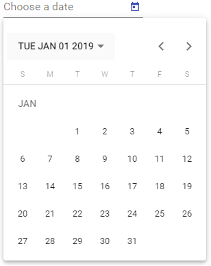
mat-datepicker startat
Angular Material datepicker validations
mat-datepicker contains three additional properties to add validation to date picker input.
- min : we can set the minimum date
- max : we can set the maximum date
- matDatepickerFilter : we can add custom validation on each date.
mat-datepicker min max date validations
Now we will learn how to enforce min max validations to mat-datepicker input using an example.
<mat-form-field>
  <input #minmaxInput matInput
    [min]="minDate"
    [max]="maxDate"
    [matDatepicker]="minmaxvalidation"
    placeholder="Pick a date">
  <mat-datepicker-toggle matSuffix [for]="minmaxvalidation">
     </mat-datepicker-toggle>
  <mat-datepicker #minmaxvalidation></mat-datepicker>
</mat-form-field>
In our component ts file we can set the minimum and maximum dates and bind them in min and max properties.
export class DatepickerComponent implements OnInit {

  constructor() { }

  minDate = new Date(1990, 0, 1);
  maxDate = new Date(2020,0,1);

  ngOnInit() {
  }

}
All of the dates before 1990 and past 2020 are unselectable and he cannot go beyond this date range.
mat-datepicker max date
mat-datepicker min date
But user can able to type the dates manually in mat-datepicker input element.
In that case input element will have validation errors.
To handle this case we can add min and max date validation messages.
mat-datepicker min max date validations with error messages
When a user manually type a date beyond min max range. The input element will have following validation errors.
- matDatepickerMin
- matDatepickerMax
We can use this two errors to display validation error messages on mat-datepicker input element.
  <mat-datepicker-toggle [for]="resultPicker"></mat-datepicker-toggle>
  <mat-form-field>
    <mat-label>Pick a date</mat-label>
    <input matInput
           #resultPickerModel="ngModel"
           [matDatepicker]="resultPicker"
           [(ngModel)]="date"
           [min]="minDate"
           [max]="maxDate">
    <mat-datepicker #resultPicker>
    </mat-datepicker>
    <mat-error *ngIf="resultPickerModel.hasError('matDatepickerParse')">
      "{{resultPickerModel.getError('matDatepickerParse').text}}"
       is not a valid date!
    </mat-error>
    <mat-error *ngIf="resultPickerModel.hasError('matDatepickerMin')">
      Minimum date should be {{maxDate | date }}</mat-error>
    <mat-error *ngIf="resultPickerModel.hasError('matDatepickerMax')">
      Maximum date should be {{maxDate | date }}
    </mat-error>
  </mat-form-field>

  export class DatepickerComponent implements OnInit {

  constructor() { }

  date : any;

  ngOnInit() {
  }

}
I am using mat-error element to display error messages.
In the above example, I have created a date variable and bind it to datepicker input element using ngModel.
Added a template reference variable #resultPickerModel to ngModel to track error messages.
And also if we enter invalid date, the input element will contain matDatepickerParse error.
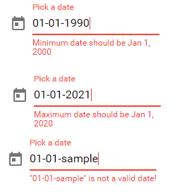
mat-datepicker with min max errors
matDatepickerFilter validation.
If we want to add custom validation on each and every date we can use matDatepickerFilter property.
For example if we want to disable selection of saturday and sunday as they are weekends we can make use of matDatepickerFilter property.
matDatepickerFilter property accepts a function of DateType => boolean (where DateType is the type of date used by the datepicker).
If the funtion returns true then the date is valid and if it is false then it is not.
We will go through an example to understand it futher.
  <mat-datepicker-toggle [for]="resultPicker"></mat-datepicker-toggle>
  <mat-form-field>
    <mat-label>Pick a date</mat-label>
    <input matInput
           #resultPickerModel="ngModel"
           [matDatepicker]="resultPicker"
           [(ngModel)]="date"
           [matDatepickerFilter]="dateFilter">
    <mat-datepicker #resultPicker>
    </mat-datepicker>
    <mat-error *ngIf="resultPickerModel.hasError('matDatepickerParse')">
      "{{resultPickerModel.getError('matDatepickerParse').text}}"
       is not a valid date!
    </mat-error>
    <mat-error *ngIf="resultPickerModel.hasError('matDatepickerFilter')">
      Date unavailable! It's a weekend.
    </mat-error>
  </mat-form-field>
And in component ts file I have added a dateFilter function to check for saturday and sunday.
export class DatepickerComponent implements OnInit {

  constructor() { }

  date : any;

  ngOnInit() {
  }


  dateFilter: (date: Date | null) => boolean =
    (date: Date | null) => {
      const day = date.getDay();
      return day !== 0 && day !== 6;
      //0 means sunday
      //6 means saturday
  }
}
And if the user manually types the date which is a weekend, the input element will have matDatepickerFilter validation error.
I am using that error to display error message.
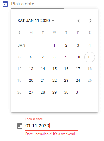
mat-datepicker filter
mat-datepicker date format
To change mat-datepicker date format in we have to write our own DateAdapter.
Steps to format the dates in mat-datepicker input
- Create a custom date adapter (PickDateAdapter) by extending
NativeDateAdapter. - Import
formatDatefrom@angular/commonto change the datepicker input format. - Add custom date picker formats (PICK_FORMATS).
- Finally add the custom date adapter and custom date formats to the provider array of component to overwrite default DateAdapter and MAT_DATE_FORMATS.
You have to import NativeDateAdapter, DateAdapter, MAT_DATE_FORMATS from angular material.
import { NativeDateAdapter, DateAdapter,
MAT_DATE_FORMATS } from '@angular/material';
The below date picker example display the date in dd-MMM-yyyy format. i.e., 08-Jan-2020.
And similarly the format dd-MM-yyyy displays the date as 07-01-2020.
For example to display date along with day use format EEEE, MMMM d, y.
i.e.,Monday, January 6, 2020
import { Component, OnInit, ViewChild } from '@angular/core';
import { FormControl } from '@angular/forms';
import { NativeDateAdapter, DateAdapter,
 MAT_DATE_FORMATS } from '@angular/material';
import { formatDate } from '@angular/common';

export const PICK_FORMATS = {
  parse: {dateInput: {month: 'short', year: 'numeric', day: 'numeric'}},
  display: {
      dateInput: 'input',
      monthYearLabel: {year: 'numeric', month: 'short'},
      dateA11yLabel: {year: 'numeric', month: 'long', day: 'numeric'},
      monthYearA11yLabel: {year: 'numeric', month: 'long'}
  }
};

class PickDateAdapter extends NativeDateAdapter {
  format(date: Date, displayFormat: Object): string {
      if (displayFormat === 'input') {
          return formatDate(date,'dd-MMM-yyyy',this.locale);;
      } else {
          return date.toDateString();
      }
  }
}

@Component({
  selector: 'app-datepicker',
  templateUrl: './datepicker.component.html',
  styleUrls: ['./datepicker.component.scss'],
  providers: [
    {provide: DateAdapter, useClass: PickDateAdapter},
    {provide: MAT_DATE_FORMATS, useValue: PICK_FORMATS}
]
})

export class DatepickerComponent implements OnInit {

  constructor() { }

  date : any;

  ngOnInit() {
  }

}
Go through the below article for the complete list of date formats.
mat-datepicker format
mat-datepicker dateClass
dateClass property used to add classes to the date picker input.
It’s very helpful in case of if you want to apply styles to the dates in calender pop up.
A real world example would be highlight holidays in a calender.
dateClass accepts a function which will be called for each and every dates in the calendar and will apply any classes that are returned from the method.
And the funtion can return object as well. i.e., we can return an ngClass object.
Highlighting dates in mat-datepicker calender.
We will highlight the weekends in calender pop-up using dateClass.
Steps to highlight dates in calender
- Define a dateClass function which will return class name in component ts file.
- Add
dateClasspropery to themat-datepickerelement and bind it to the funtion created above. - Define styles for the dateClass in component styles.css file.
- Add
encapsulation: ViewEncapsulation.Noneto the component declaration.
The below examples highlight the weekends in calender pop up i.e., saturday and sunday.
<mat-datepicker-toggle [for]="resultPicker"></mat-datepicker-toggle>
  <mat-form-field>
    <mat-label>Pick a date</mat-label>
    <input matInput
           #resultPickerModel="ngModel"
           [matDatepicker]="resultPicker"
           [(ngModel)]="date"
           >
    <mat-datepicker #resultPicker [dateClass]="dateClass">
    </mat-datepicker>
</mat-form-field>

@Component({
  selector: 'app-datepicker',
  templateUrl: './datepicker.component.html',
  styleUrls: ['./datepicker.component.scss'],
  encapsulation: ViewEncapsulation.None
})
export class DatepickerComponent implements OnInit {

  constructor() { }

  date : any;

  ngOnInit() {
  }


  dateClass = (d: Date) => {
    const date = d.getDay();
    // Highlight saturday and sunday.
    return (date === 0 || date === 6) ? 'highlight-dates' : undefined;
  }
}
And add styles to the highlight-dates class in datepicker.component.scss file.
.highlight-dates{
    background: red;
    border-radius: 100%;
}
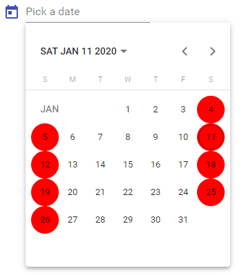
highlighting dates in datepicker angular
Disable mat-datepicker
We can disable the datepicker by adding disabled property to the input element.
<mat-form-field>
    <input matInput [matDatepicker]="disabledatepicker"
      placeholder="disabled datepicker" disabled>
    <mat-datepicker-toggle matSuffix [for]="disabledatepicker">
    </mat-datepicker-toggle>
    <mat-datepicker #disabledatepicker></mat-datepicker>
</mat-form-field>
Disable mat-datepicker-toggle
To disable only datepicker toggle we can add dispabled property to the mat-datepicker-toggle element.
<mat-form-field>
  <input matInput [matDatepicker]="disabletoggle"
  placeholder="disabled datepicker toggle">
  <mat-datepicker-toggle matSuffix [for]="disabletoggle" disabled>
  </mat-datepicker-toggle>
  <mat-datepicker #disabletoggle></mat-datepicker>
</mat-form-field>
In this case user can only enter date by manually typing.
Disable mat-datepicker input
When we add disabled property on input element <mat-datepicker> and <mat-datepicker-toggle> will inherit the disabled state, that’s why both datepicker and datepicker-toggle are disabled.
But we can override disabled property at datepicker and toggle elements.
<mat-form-field>
  <input matInput [matDatepicker]="disabletext" placeholder="" disabled>
  <mat-datepicker-toggle matSuffix [for]="disabletext">
  </mat-datepicker-toggle>
  <mat-datepicker #disabletext disabled="false">
  </mat-datepicker>
</mat-form-field>
So now we cannot enter date manually but can be selected through calender pop up.

mat-datepicker disabled
mat-datepicker disable manual typing in input element
The above approach can be used to disable typing in date picker input. But the selected date will be in gray color.
So to disable typing in datepicker, add readonly propery to input element.
<mat-form-field>
  <input matInput [matDatepicker]="disableTyping"
  placeholder="disable typing" readonly>
  <mat-datepicker-toggle matSuffix [for]="disableTyping">
  </mat-datepicker-toggle>
  <mat-datepicker #disableTyping></mat-datepicker>
</mat-form-field>
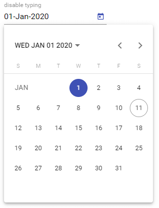
mat-datepicker disabled typing
mat-datepicker touch Ui mode in mobile devices
Normally in datepicker calender popup will be displayed under the input element.
But in mobile devices we don’t have much space and we need bigger real estate to click and select dates.
mat-datepicker comes up with touchUi property, if we set to true calendar opens in a large touch friendly UI dialog.
<mat-form-field>
  <input matInput [matDatepicker]="touchUi" placeholder="mobile touchUi">
  <mat-datepicker-toggle matSuffix [for]="touchUi"></mat-datepicker-toggle>
  <mat-datepicker touchUi="true" #touchUi></mat-datepicker>
</mat-form-field>
mat-datepicker touch ui mobile
Change mat-datepicker color
To change the color of mat-datepicker we can make use of color property which accepts themepalette (primary, accent, or warn).
<mat-form-field>
  <mat-label>mat-datepicker color</mat-label>
  <input matInput [matDatepicker]="datepickercolor">
  <mat-datepicker-toggle matSuffix [for]="datepickercolor">
  </mat-datepicker-toggle>
  <mat-datepicker #datepickercolor color="warn"></mat-datepicker>
</mat-form-field>
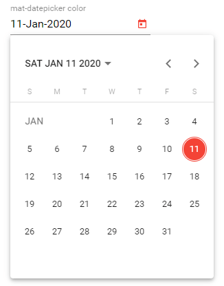
mat-datepicker color change
Common errors while implementing mat-datepicker
Now we will go through the most common errors while adding mat-datepicker in our angular applications.
Error: ‘mat-form-field’ is not a known element
To fix mat-form-field is not a known element error import MatInputModule along with MatDatepickerModule other wise you will get following error.
‘mat-form-field’ is not a known element: 1. If ‘mat-form-field’ is an Angular component, then verify that it is part of this module. 2. If ‘mat-form-field’ is a Web Component then add ‘CUSTOM_ELEMENTS_SCHEMA’ to the ‘@NgModule.schemas’ of this component to suppress this message.
Error: MatDatepicker: No provider found for DateAdapter
To fix No provider found for DateAdapter error we have to import MatNativeDateModule or MatMomentDateModule in our app.module.ts file or common material module.
Oe we can add our own custom date adapter as explained above.
Error: MatDatepicker: No provider found for DateAdapter. You must import one of the following modules at your application root: MatNativeDateModule, MatMomentDateModule, or provide a custom implementation.
Error: A MatDatepicker can only be associated with a single input.
If more than one matInput elements connected to same mat-datepicker we will get A MatDatepicker can only be associated with a single input
error.
<mat-form-field>
    <input matInput [matDatepicker]="pickerSame"
    placeholder="Choose a date">
    <mat-datepicker-toggle matSuffix [for]="pickerSame">
    </mat-datepicker-toggle>
    <mat-datepicker #pickerSame></mat-datepicker>
</mat-form-field>

<mat-form-field>
  <input matInput [matDatepicker]="pickerSame"
  placeholder="Choose a date">
  <mat-datepicker-toggle matSuffix [for]="pickerSame">
  </mat-datepicker-toggle>
  <mat-datepicker #pickerSame></mat-datepicker>
</mat-form-field>
In the above code two input elements are connrected to same matDatepicker element i.e., pickerSame.
Error: Attempted to open an MatDatepicker with no associated input
See the below code
<mat-form-field>
    <input matInput [matDatepicker]="pickerdate"
    placeholder="Choose a date">
    <mat-datepicker-toggle matSuffix [for]="datepicker">
    </mat-datepicker-toggle>
    <mat-datepicker #datepicker></mat-datepicker>
</mat-form-field>
In the above code, I am connecting input element to pickerdate which does not exists in component file. In that case we will get following error.
Error: Attempted to open an MatDatepicker with no associated input.