Angular Material Badge: mat Badge example
Angular Material Badge (mat Badge), used to display notifications counts like unread messages in Gmail.
matBadge selector is used to display the badges on top of UI elements.
It is part of Angular material module called MatBadgeModule.
Angular Material Badge
A badge is nothing but a small circle,that will be displayed on top of other HTML elements or angular components.
An anuglar material badge may contain a number or small set of characters.
A badge can be used on top of
- Text
- Buttons
- Icons
Steps to implement notification badges in Angular.
step 1: Import MatBadgeModule
We can import badge module in our component ts file or app.module.ts file or some common material module which can be used across the application as explained in angular material tutorial.
import {MatBadgeModule} from '@angular/material'
step 2: Use mat Badge directive to display status descriptors
After importing angular material badge module. We can use mat Badge directive to display notification texts as shown below.
<p>
  <span matBadge="10">Badge Text</span>
</p>
Adding mat Badge to the buttons
<button mat-raised-button
        color="primary"
        matBadge="14">
      Action
</button>
Adding mat Badge to Icons
<mat-icon matBadge="10">
         notifications
</mat-icon>
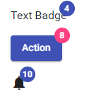
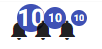
MatBadge example
mat Badge overlap
If you see the above image the badge is overlapped with the host element.
For icons i.e, notifications and buttons it looks good. But for the text it’s kind of weird.
To remove overlapping of badge with the host element we can use matBadgeOverlap property.
  <span matBadge="4" matBadgeOverlap=false>Text Badge</span>
  <button mat-raised-button color="primary"
        matBadge="8"  matBadgeColor="accent" matBadgeOverlap=false>
      Action
   </button>
   <mat-icon matBadge="10" matBadgeOverlap=false>notifications</mat-icon>
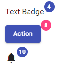
MatBadge Overlap
Changing mat Badge Position
By default, material badge will be displayed on top right corner of the element.
We can change the position of mat Badge by using matBadgePosition input.
matBadgePosition accepts four values as listed below.
- above after (Top right corner)
- above before (Top left corner)
- below before (Bottom left corner)
- below after (Bottom right corner)
The default value is above after.
    <mat-icon matBadge="10" matBadgePosition="above after">
         notifications
    </mat-icon>
    <mat-icon matBadge="10" matBadgePosition="above before">
         notifications
    </mat-icon>
    <mat-icon matBadge="10" matBadgePosition="below after">
         notifications
    </mat-icon>
    <mat-icon matBadge="10" matBadgePosition="below before">
         notifications
    </mat-icon>
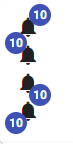
MatBadge Position
In most of the cases we will not be using mat badge position as badge is like notification and always displayed on top of other elements.
Changing mat Badge Color
To change the color of mat Badge we can use matBadgeColor attribute as shown below.
<mat-icon matBadge="22" matBadgeColor="primary">
  notifications
</mat-icon>
<mat-icon matBadge="22" matBadgeColor="accent">
  notifications
</mat-icon>
<mat-icon matBadge="22" matBadgeColor="warn">
  notifications
</mat-icon>
The default value is primary.
We can change the color of mat Badge to the default theme themePalettes like primary, accent, or warn.
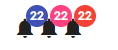
changing MatBadge color
Giving Custom Color to mat Badge
As explained above we can pass only default themePalettes to matBadgeColor attribute.
To give our own custom color to material badge we can override the CSS of mat Badge elemenet.
.mat-badge-content{
  background : black
}
Changing text color of mat Badge Content
By default the text color of material badge content is white.
To change the text color of mat Badge content we can change the CSS of .mat-badge-content class as shown below.
.mat-badge-content{
  color : yellow
}
MatBadge custom color
Changing size of mat Badge
Angular material will provide three sizes for mat Badge.
- small
- medium
- large
The default size of the badge is medium.
We can change the size of mat Badge by using matBadgeSize attribute as shown below.
<mat-icon matBadge="10" matBadgeSize="large">
  notifications
</mat-icon>
<mat-icon matBadge="10" matBadgeSize="medium">
  notifications
</mat-icon>
<mat-icon matBadge="10" matBadgeSize="small">
  notifications
</mat-icon>
change matBadge size
Changing mat Badge content dynamically.
In the above example we are using static values for material badge content.
To change mat Badge content dynamically, we can bind a variable to matBadge and update it whenever required as shown below.
<mat-icon [matBadge]="badgeContent">
  notifications
</mat-icon>


export class BadgeComponent implements OnInit {

  badgeContent : number;
  constructor() {
    this.badgeContent = 10;
  }

  ngOnInit() {
  }

}
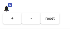
Now we will create a notification counter using mat Badge
Notification Counter Using mat Badge
I have created a componet called NotificationBadgeComponent and in that added a variable named badgeCounter.
badgeCounter variable is binded to [matBadge].
By default the counter value is ‘0’.
To increase or decrease the counter, I created two buttons + and - and one button is to reset the counter.
On clicking these buttons badgeCounter will either increase or decrease.
<mat-card>
    <mat-icon [matBadge]="badgeCounter" matBadgeSize="small">
      notifications
    </mat-icon>
    <br/>
    <button mat-raised-button (click)="incrementCount()">+</button>
    <button mat-raised-button (click)="decreaseCount()">-</button>
    <button mat-raised-button (click)="resetCount()">reset</button>
</mat-card>


export class NotificationBadgeComponent implements OnInit  {

  badgeCounter: number;

  constructor() {
    this.badgeCounter = 0;
  }

  incrementCount() {
    this.badgeCounter++;
  }

  decreaseCount() {
    if(this.badgeCounter < 0)
     return;
    this.badgeCounter++;
  }

  resetCount() {
    this.badgeCounter = 0;
  }
}
Now the problem is even though the counter is ‘0’. The badge content still displayed with value zero.
Ideally when there are no notifications we wont be showing count as zero, will simply hide the notifications.
Notification Counter matBadge
Display or Hide mat Badge
We can display or hide the material badge by using matBadgeHidden property.
If matBadgeHidden is true then mat Badge will be hidden.
<mat-icon matBadge="22" matBadgeHidden="true">
  notifications
</mat-icon>
Now in the above example with the help of matBadgeHidden we can hide the notifications, when the counter became zero.
I have created a variable called hideMatBadge and the value will be toggled when the counter will became zero.
<mat-icon [matBadge]="badgeCounter" [matBadgeHidden]="hideMatBadge">
  notifications
</mat-icon>


export class BadgeComponent implements OnInit {

  hideMatBadge : boolean;
  badgeCounter: number;


  constructor() {
    this.hideMatBadge = true;
    this.badgeCounter = 0;
  }

  ngOnInit() {
  }

  incrementCount() {
    this.badgeCounter++;
    this.hideMatBadge = false;
  }

  decreaseCount() {
    if(this.badgeCounter < 0)
     return;
    this.badgeCounter--;
    if(badgeCounter == 0){
      this.hideMatBadge = true;
    }
  }

  resetCount() {
    this.badgeCounter = 0;
    this.hideMatBadge = true;
  }

}
And actually It’s not required to create an extra variable (hideMatBadge), we can directly pass an expression to [matBadgeHidden] input.
If the badgeCounter is zero hide the badge.
<mat-icon [matBadge]="badgeCounter" [matBadgeHidden]="badgeCounter==0">
      notifications
</mat-icon>
mat Badge disabled
When a badge is added to an element, for instance button, and if the button element is disabled, the badge color will be shown according to primary, accent, or warn color irrespective of host element shown below.
<button mat-raised-button
      color="primary"
      matBadge="8"
      matBadgePosition="before"
      matBadgeColor="primary"
      disabled>
    Action
</button>
So in such cases to disable mat Badge we can use [matBadgeDisabled] input property.
<button mat-raised-button
       color="primary"
       matBadge="8"
       matBadgePosition="before"
       matBadgeColor="primary"
       disabled
       matBadgeDisabled=true>
    Action
</button>
But remember that it just changes the color of mat Badge to gray. And it is possible change the mat Badge content dynamically as explained above.