fxLayoutGap API in Angular flex layout
fxLayoutGap API is one of the static API in Angular flex layout. And in this tutorial we will understand how fxLayoutGap will work using simple detailed examples.
What is fxLayoutGap API?
- fxLayoutGap is used to specify gap between flex children items inside flex container.
- fxLayoutGap is an optional API.
- fxLayoutGap directive should be added to parent container i.e, flex container.
We will create a component called FxLayoutGapExampleComponent in our angular project to understand it further.
fxLayoutGap example
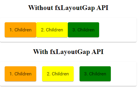
First we will see how children elements inside the container renders without fxLayoutGap directive.
<h2> Without fxLayoutGap API</h2>

<mat-card fxLayout>
    <mat-card class="child-1">1. Children</mat-card>
    <mat-card class="child-2">2. Children</mat-card>
    <mat-card class="child-3">3. Children</mat-card>
</mat-card>
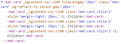
Now we will add a gap between flex children items using fxLayoutGap.
I have added a 20px gap between flex items inside the flex container.
<h2> With fxLayoutGap API</h2>

<mat-card fxLayout fxLayoutGap="20px">
    <mat-card class="child-1">1. Children</mat-card>
    <mat-card class="child-2">2. Children</mat-card>
    <mat-card class="child-3">3. Children</mat-card>
</mat-card>
fxLayoutGap example
How fxLayoutGap will work?
When we add fxLayoutGap to the parent container, Angular flex layout will add an inline CSS margin-right or margin-bottom to the children items depending upon the flex layout row or column.
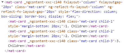
fxLayoutGap CSS
The inline CSS will be added to all the children items except last one.
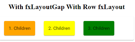
fxLayoutGap with fxLayout row
When we are using fxLayputGap with row layout margin-right inline CSS will be added to the flex children.
<h2> With fxLayoutGap With Row fxLayout</h2>

<mat-card fxLayout="row" fxLayoutGap="30px">
    <mat-card class="child-1">1. Children</mat-card>
    <mat-card class="child-2">2. Children</mat-card>
    <mat-card class="child-3">3. Children</mat-card>
</mat-card>
fxLayoutGap row example
In the above row layout example, I have added a gap of 30px between flex children items using fxLayoutGap.

fxLayoutGap row CSS
fxLayoutGap with fxLayout column
When we use fxLayoutGap to the column layout margin-bottom inline CSS will be added to the flex children.
<h2> With fxLayoutGap With column fxLayout</h2>

<mat-card fxLayout="column" fxLayoutGap="20px">
    <mat-card class="child-1">1. Children</mat-card>
    <mat-card class="child-2">2. Children</mat-card>
    <mat-card class="child-3">3. Children</mat-card>
</mat-card>
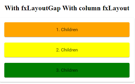
fxLayoutGap column example
In the above column layout example, A gap of 20px will be added between flex children items as I have added fxLayoutGap as 20px.
fxLayoutGap column CSS
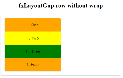
fxLayoutGap row wrap
If we are using wrap with fxLayout to wrap the the flex children items inside row or column layout, we should consider fxLayoutGap sizes when adding the flex item sizes for children elements using fxFlex.
Have a look at the below example. We have four flex items and each children has fxFlex of 50%.
Ideally they should align in two columns. But as I gave fxLayoutGap as 30px. All flex items will be aligned in single column.
<h2>fxLayoutGap with wrap</h2>

<mat-card fxLayout="row wrap" fxLayoutGap="30px">
    <mat-card class="child-1" fxFlex="50">1. One</mat-card>
    <mat-card class="child-2" fxFlex="50">1. Two</mat-card>
    <mat-card class="child-3" fxFlex="50">1. Three</mat-card>
    <mat-card class="child-1" fxFlex="50">1. Four</mat-card>
</mat-card>
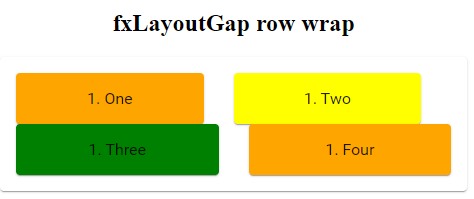
fxLayoutGap no row wrap
So using calc function, I am calculating flex item width size by considering fxLayoutGap size so that items will be aligned in two columns.
<h2>fxLayoutGap with wrap</h2>

<mat-card fxLayout="row wrap" fxLayoutGap="30px">
    <mat-card class="child-1" fxFlex="calc(50%-30px)">1. One</mat-card>
    <mat-card class="child-2" fxFlex="calc(50%-30px)">1. Two</mat-card>
    <mat-card class="child-3" fxFlex="calc(50%-30px)">1. Three</mat-card>
    <mat-card class="child-1" fxFlex="calc(50%-30px)">1. Four</mat-card>
</mat-card>
fxLayoutGap row wrap
fxLayoutGap column wrap
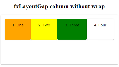
Similarly for the column layout also fxLayoutGap will affect the wrapping of elements, if we won’t consider it while giving widths to flex children using fxFlex.
<h2>fxLayoutGap column without wrap</h2>

<mat-card fxLayout="column wrap" fxLayoutGap="30px" style="height: 200px;">
    <mat-card class="child-1" fxFlex="50">1. One</mat-card>
    <mat-card class="child-2" fxFlex="50">2. Two</mat-card>
    <mat-card class="child-3" fxFlex="50">3. Three</mat-card>
    <mat-card class="child-4" fxFlex="50">4. Four</mat-card>

</mat-card>
fxLayoutGap column no wrap
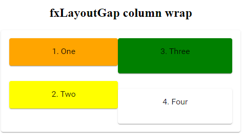
With calc() function and fxLayoutGap width.
<h2>fxLayoutGap column wrap</h2>

<mat-card fxLayout="column wrap" fxLayoutGap="30px" style="height: 200px;">
    <mat-card class="child-1" fxFlex="calc(50%-30px)">1. One</mat-card>
    <mat-card class="child-2" fxFlex="calc(50%-30px)">2. Two</mat-card>
    <mat-card class="child-3" fxFlex="calc(50%-30px)">3. Three</mat-card>
    <mat-card class="child-4" fxFlex="calc(50%-30px)">4. Four</mat-card>

</mat-card>
fxLayoutGap column wrap
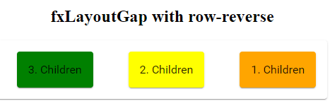
fxLayoutGap with row-reverse
When we add fxLayoutGap in row reverse layout margin-left inline css will be added to the children flex items.
<h2>fxLayoutGap with row-reverse</h2>

<mat-card fxLayout="row-reverse" fxLayoutGap="50px">
    <mat-card class="child-1">1. Children</mat-card>
    <mat-card class="child-2">2. Children</mat-card>
    <mat-card class="child-3">3. Children</mat-card>
</mat-card>
fxLayoutGap row reverse example
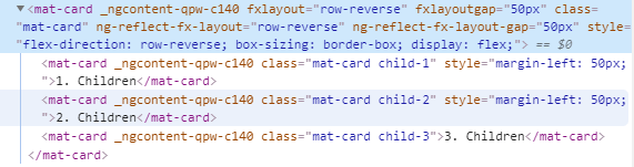
fxLayoutGap row reverse CSS
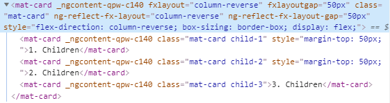
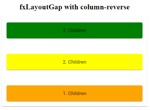
fxLayoutGap with column-reverse
While using fxLayoutGap with column reverse layout margin-top inline css will be added to the children flex items.
<h2>fxLayoutGap with column-reverse</h2>

<mat-card fxLayout="column-reverse" fxLayoutGap="50px">
    <mat-card class="child-1">1. Children</mat-card>
    <mat-card class="child-2">2. Children</mat-card>
    <mat-card class="child-3">3. Children</mat-card>
</mat-card>
fxLayoutGap column reverse