fxLayout API in Angular flex layout
In this tutorial we will learn how to use fxLayout API in Angular flex layout with examples.
What is fxLayout API?
- fxLayout is a required and necessary API in Angular flex layout, should be used on flex container.
- fxLayout defines the flow of children elements along the main-axis or cross-axis, inside the flex container.
- Depending upon our layout we can pass four different values to the fxLayout attribute row,column, row-reverse and column-reverse.
- In addition to the fxLayout accepts other parameters like wrap and inline.
fxLayout is case sensitive. So Use “fxLayout” only. “L” Capital.
We will go through an example to understand it further. I have created a component called FxLayoutExampleComponent.
We will go through each and every fxLayout values and play around with them.
Flex items are the children of a flex container. They are positioned along a main axis and a cross axis. The main axis is horizontal by default, so the items flow into a row.
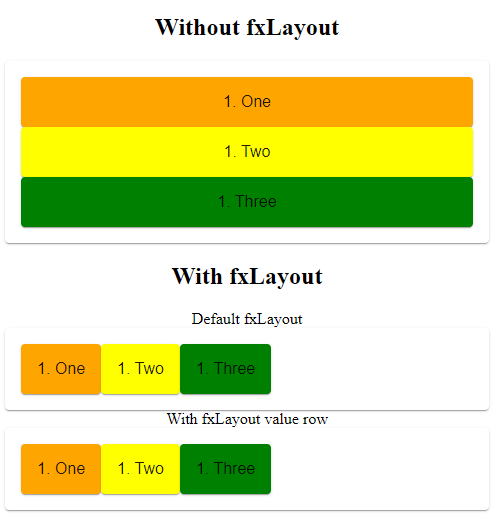
If you are not giving any value to the fxLayout. The layout will be row. fxLayout default value is row.
fxLayout row
fxLayout row will display the flex items along the main axis i.e, horizontal axis, inside the flex container.
In the below example I have two mat-card elements with three children elements, added fxLayout attribute with value row, to the one of them.
<h2> Without fxLayout</h2>

<mat-card>
    <mat-card class="child-1">1. One</mat-card>
    <mat-card class="child-2">1. Two</mat-card>
    <mat-card class="child-3">1. Three</mat-card>
</mat-card>

<h2> With fxLayout</h2>

Default fxLayout
<mat-card fxLayout>
    <mat-card class="child-1">1. One</mat-card>
    <mat-card class="child-2">1. Two</mat-card>
    <mat-card class="child-3">1. Three</mat-card>
</mat-card>

With fxLayout value row
<mat-card fxLayout="row">
    <mat-card class="child-1">1. One</mat-card>
    <mat-card class="child-2">1. Two</mat-card>
    <mat-card class="child-3">1. Three</mat-card>
</mat-card>
fxLayout row example
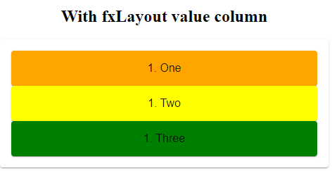
fxLayout column
fxLayout column will display flex items children along the vertical axis inside the container.
<div fxLayout="column">
  <div>1. One</div>
  <div>2. Two</div>
  <div>3. Three</div>
  <div>4. Four</div>
</div>
fxLayout column example
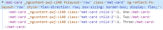
How fxLayout works?
You might be wondering how adding an attribute fxLayout will magically change the flow of elements inside the container.
If you have prior experience in CSS flex box you might be knowing, how it will work internally.
When we add fxLayout attribute with row value, Angular flex layout internally adds inline css to the flex container, which decides the flow of children.
In the above example fxLayout row attribute adds the below CSS to the flex container.
flex-direction: row;
box-sizing: border-box;
display: flex;
The above CSS properties will decides the flow of flex items.
fxLayout row will adds the flex-direction property with the value row.
Similarly fxLayout column attribute adds the below inline CSS.
flex-direction: column;
box-sizing: border-box;
display: flex;
fxLayout row CSS example

fxLayout column CSS example
fxLayout wrap
Even though there is no space along the horizontal axis, Flex items inside the flex container always displayed in single line.
By default wrapping is not enabled.
<h2>With fxLayout no row wrap</h2>

<mat-card fxLayout="row" fxLayoutGap="30px">
    <mat-card class="child-1">1. One</mat-card>
    <mat-card class="child-2">1. Two</mat-card>
    <mat-card class="child-3">1. Three</mat-card>
    <mat-card class="child-3">1. Four</mat-card>
    <mat-card class="child-3">1. Five</mat-card>
    <mat-card class="child-3">1. Six</mat-card>
</mat-card>
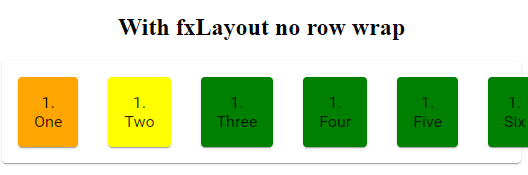
fxLayout row no wrap
fxLayout row wrap
To wrap flex items in multiple lines add “wrap” parameter in addition to the direction.
<div fxLayout="row wrap"></div>
I have added fxLayoutGap to give some space between flex items.
<h2>With fxLayout row wrap</h2>

<mat-card fxLayout="row wrap" fxLayoutGap="30px">
    <mat-card class="child-1">1. One</mat-card>
    <mat-card class="child-2">1. Two</mat-card>
    <mat-card class="child-3">1. Three</mat-card>
    <mat-card class="child-3">1. Four</mat-card>
    <mat-card class="child-3">1. Five</mat-card>
    <mat-card class="child-3">1. Six</mat-card>
</mat-card>
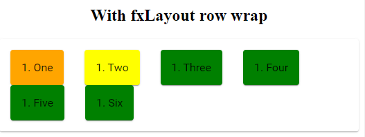
fxLayout row wrap
fxLayout row wrap will add following inline CSS to the fxLayout container.
flex-flow: row wrap;
box-sizing: border-box;
display: flex;
fxLayout column wrap
Similary to wrap flex items in column layout, along the vertical axis we should add “wrap” along with “column” property to the fxLayout.
To understand this I have added fixed height (style=“height:200px;“) to fxLayout container.
<h2>With fxLayout no column wrap</h2>

<mat-card fxLayout="column" fxLayoutGap="30px" style="height:200px;">
    <mat-card class="child-1">1. One</mat-card>
    <mat-card class="child-2">1. Two</mat-card>
    <mat-card class="child-3">1. Three</mat-card>
    <mat-card class="child-3">1. Four</mat-card>
    <mat-card class="child-3">1. Five</mat-card>
    <mat-card class="child-3">1. Six</mat-card>
</mat-card>
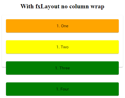
fxLayout column no wrap
Now we will add wrap to fxLayout column and see how it will work.
<h2>With fxLayout column wrap</h2>

<mat-card fxLayout="column wrap" fxLayoutGap="30px" style="height:200px;">
    <mat-card class="child-1">1. One</mat-card>
    <mat-card class="child-2">1. Two</mat-card>
    <mat-card class="child-3">1. Three</mat-card>
    <mat-card class="child-3">1. Four</mat-card>
    <mat-card class="child-3">1. Five</mat-card>
    <mat-card class="child-3">1. Six</mat-card>
    <mat-card class="child-3">1. Six</mat-card>

</mat-card>
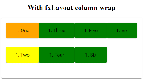
fxLayout column wrap
The following CSS code will be added to the fxLayout container.
height: 200px;
flex-flow: column wrap;
box-sizing: border-box;
display: flex;
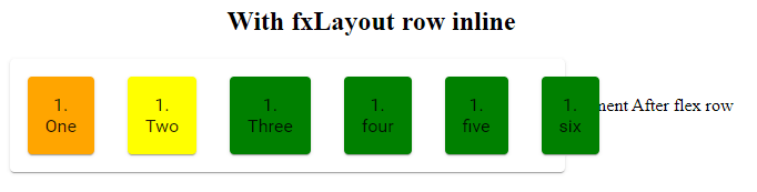
fxLayout inline
If you want use inline-flex CSS display property, instead of the default flex.
We can add inline as secondary parameter along with layout direction property.
<div fxLayout="row inline">
  <div>1. Child</div> <div>2. Child</div> <div>3. Child</div>
</div>
So what’s the difference between display flex vs display inline flex?
fxLayout display flex vs inline flex
Display inline flex makes the flex container(parent) display inline not flex items(children).
I have added inline property to the fxLayout and some text after flex container.
<h2>With fxLayout row inline</h2>
<mat-card fxLayout="row inline" fxLayoutGap="30px" style="width: 500px;">
<mat-card class="child-1">1. One</mat-card>
<mat-card class="child-2">1. Two</mat-card>
<mat-card class="child-3">1. Three</mat-card>
<mat-card class="child-3">1. four</mat-card>
<mat-card class="child-3">1. five</mat-card>
<mat-card class="child-3">1. six</mat-card>
</mat-card>
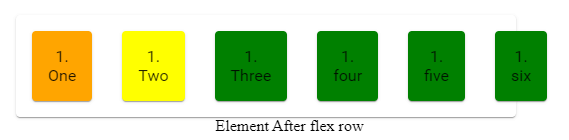
Element After flex row
As I gave “width:500px” and no wrap. The elements inside the flex container will not wrap and will be overflowed on top of text because the parent container has display inline flex.
width: 500px;
flex-direction: row;
box-sizing: border-box;
display: inline-flex;
fxLayout inline
In the default view it’s not the case. As flex container takes entire available width, so elements after flex container will be displayed in next line.
<h2>With fxLayout default</h2>

<mat-card fxLayout="row" fxLayoutGap="30px" style="width: 500px;">
    <mat-card class="child-1">1. One</mat-card>
    <mat-card class="child-2">1. Two</mat-card>
    <mat-card class="child-3">1. Three</mat-card>
    <mat-card class="child-3">1. four</mat-card>
    <mat-card class="child-3">1. five</mat-card>
    <mat-card class="child-3">1. six</mat-card>
</mat-card>

Element After flex row
fxLayout default flex
when using wrap or inline, we must specify the fxLayout direction i.e, row or column.
fxLayout row-reverse
When you add fxLayout with row-reverse value, The display of flex items will start from the opposite direction along the main axis.
<h2>fxLayout Normal</h2>

<mat-card fxLayout="row" fxLayoutGap="30px" style="width: 500px;">
    <mat-card class="child-1">1. One</mat-card>
    <mat-card class="child-2">2. Two</mat-card>
    <mat-card class="child-3">3. Three</mat-card>
</mat-card>

<h2>fxLayout row reverse</h2>

<mat-card fxLayout="row-reverse" fxLayoutGap="30px" style="width: 500px;">
    <mat-card class="child-1">1. One</mat-card>
    <mat-card class="child-2">2. Two</mat-card>
    <mat-card class="child-3">3. Three</mat-card>
</mat-card>
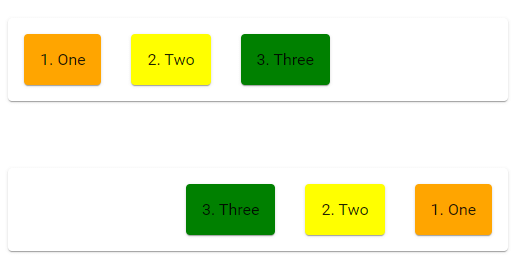
fxLayout row reverse
fxLayout column-reverse
If you use fxLayout column-reverse, the display of flex items will start from botton to top along the vertical axis.
<h2>fxLayout Column Normal</h2>

<mat-card fxLayout="column" fxLayoutGap="30px" style="height: 200px;">
    <mat-card class="child-1">1. One</mat-card>
    <mat-card class="child-2">2. Two</mat-card>
    <mat-card class="child-3">3. Three</mat-card>
</mat-card>

<h2>fxLayout column reverse</h2>

<mat-card fxLayout="column-reverse" fxLayoutGap="30px" style="height: 200px;">
    <mat-card class="child-1">1. One</mat-card>
    <mat-card class="child-2">2. Two</mat-card>
    <mat-card class="child-3">3. Three</mat-card>
</mat-card>
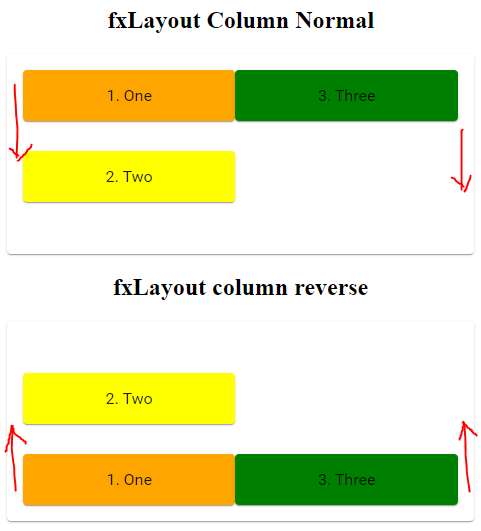
fxLayout column reverse
Changing fxLayout from row to column and vice versa.
As explained in Angular flex layout basics. We can changed fxLayout value from row to column and column to row using flex layout responsive API.
<mat-card fxLayout="row" fxLayout.xs="column">
   <mat-card class="child-1">1. Children</mat-card>
   <mat-card class="child-2">2. Children</mat-card>
   <mat-card class="child-3">3. Children</mat-card>
</mat-card>
In the above example the flow of children will be along the main axis, But whenever the width of the screen is extra small they will flow along the vertical axis.