Understanding fxFlex API in Angular flex layout
In this tutorial we will learn how to use fxFlex API in Angular flex layout with examples.
What is fxFlex API?
- fxFlex is one of the most useful and powerful API in Angular flex layout.
- fxFlex should be used on children elements inside a
fxLayoutcontainer. - fxFlex is responsible for resizing the elements(flex-items) along the main-axis of the layout.
How to use fxFlex API?
fxFlex accepts three parameters
- flex-grow
- flex-shrink
- flex-basis
fxflex syntax
The syntax is very simple we have to pass flex grow, shrink and basis parameters to fxFlex property as shown below
/*fxFlex long form syntax*/
<div fxFlex="<flex-grow> <flex-shrink> <flex-basic>"></div>

/*fxFlex short form syntax*/
<div fxFlex="<flex-basic>"></div>
flex-grow
flex grow specifies how much the flexbox item will grow relative to the rest of the flexbox items inside the same flex container, when there is enough space.
In CSS,The flex-grow value overrides the width property of flex box item.
But in angular flex layout module it will work only when we add flex basis value as “auto”.
flex-shrink
flex shrink specifies how much the flexbox item should shrink relative to the rest of the flexbox items in the same flex container, when there isn’t enough space.
flex-basis
In CSS, the flex-basis property specifies the initial default size of the flex box item before it is changed by other flexbox properties like flex grow and shrink.
But in Angular flex layout, once you specify the initial size, the flex item will not grow or shrink even we specify the grow and shrink properties.
If we set flex item initial size with flex basis property, the item will not grow or shrink, the grow/shrink is relative to the other flex items works only when we set flex basis value to “auto”
Depending upon our requirement we can use fxFlex short form or long form.
fxFlex short-form
In fxFlex short form we can specify only flex basis and it uses default values for flex-grow and flex-shrink.
<div fxLayout="row">
  <div fxFlex="<flex-basic>"></div>
</div>
The default values of flex-grow and flex-shrink are 1.
fxFlex long-form
In fxFlex long form we can add flex-grow, flex-shrink, and flex-basis values for the flex items.
<div fxLayout="row">
  <div fxFlex="<flex-grow> <flex-shrink> <flex-basic>"></div>
</div>
fxFlex Options
We can give flex basis values in the following units
- pixels
- percentages
- calc()
- em
- vw
- vh
- aliases
If no unit is specified the default unit is percentage(%).
For example fxFlex=“30” means flex:1 1 30%
List of Flex basis aliases
flex basis aliases are shorthand terms used to specify Flexbox stylings.
Here are the List of Flex basis aliases and its euivalent CSS styles
| flex basis | CSS equivalent |
|---|---|
| grow | flex: 1 1 100% |
| initial | flex: 0 1 auto |
| auto | flex: grow shrink 100% |
| none | flex: 0 0 auto |
| nogrow | flex: 0 1 auto |
| noshrink | flex: 1 0 auto |
fxFlex Example
Now we will go through an example to understand it further.
Create a component in your angular application and install flex layout module as explained in previous articles.
And in component template file add the following code.
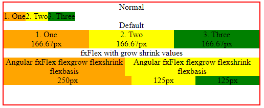
<div class="container">

    <h2>Normal</h2>
    <div class="flex-container" fxLayout="row">
      <div class="child-1">1. One</div>
      <div class="child-2">2. Two</div>
      <div class="child-3">3. Three</div>
    </div>

    <h2>Default</h2>
    <div class="flex-container" fxLayout="row">
      <div class="child-1" fxFlex>1. One</div>
      <div class="child-2" fxFlex>2. Two</div>
      <div class="child-3" fxFlex>3. Three</div>
    </div>

    <h2>fxFlex with grow shrink values</h2>
    <div class="flex-container" fxLayout="row">
      <div class="child-1" fxFlex="2 1 0">1. One</div>
      <div class="child-2" fxFlex>2. Two</div>
      <div class="child-3" fxFlex>3. Three</div>
    </div>

</div>
Add the below CSS styles to differentiate flex box items.
.child-1
{
    background-color: orange;
}

.child-2{
    background-color: yellow;
}

.child-3{
    background-color: green;
}

.container{
     margin: 15px;
     height:200px;
     width:500px;
     border:2px solid red;
}
In the first container, I have not applied any fxFlex styles to the flex box items, so the items took minimum width and aligned side by side as the flex layout is row.
In the second container, I added fxFlex to all flexbox items and not given any flex grow,shrink or basis values. So it will take default values.
i.e., fxFlex means fxFlex=“1 1 0%”.
So the flexbox items will have same width i.e., 166.67px (Approx)
Now in third container, for the first flex box item added fxFlex grow and shrink values as 2.
<div fxFlex="2 1 0"></div>
The container width is 500px.
The width of first flexbox item (with fxFlex grow 2) will be, double the size of other two elements.
i.e, first element will be of width 250px. And other two elements will have 125px each.
fxFlex example
How flex grow works?
flex grow values can be 0 or 1 or any integer value.
- 0 means Do not stretch. Size will be element’s content width, or ‘flex-basis’.
- 1: (Default value). Stretch; will be the same size to all other flex items on the same row since they have a default value of 1.
- ≥2 (integer n): Stretch. Will be n times the size of other elements with ‘flex-grow: 1’ on the same row.
How flex shrink works?
To understand the how flex shrink will work, we set flex box items basis to “auto”.
<div class="flex-container" fxLayout="row">
    <div class="child-1" fxFlex="1 2 auto">
      Angular fxFlex flexgrow flexshrink flexbasis </div>
    <div class="child-2" fxFlex="1 1 auto">
      Angular fxFlex flexgrow flexshrink flexbasis </div>
</div>
Both flex items has flex grow value as 1. That means if there is enough space both items will have same width.
The first flex box item has a shrink value 2.
As the width of the flex container decreases, the first element will shrink more when compared the second one based upon the available space.
As long as there is enough space inside the container the both flex items try to maintain same width.
fxFlex calc
To specify flex basis we can use calc function as shown below
<div fxFlex="2 1 calc(10px+100px)"></div>
Now the above element will have a flex basis value 110px.