In this tutorial I will explain how to use Font Awesome icons in Angular applications using @fortawesome/angular-fontawesome package.
Angular Font Awesome icons package i.e, @fortawesome/angular-fontawesome is an official Angular component for Font Awesome 5+ icons.
First we will learn basic Font Awesome icons rendering in Angular and then we will go through some cool Font Awesome icons features like animations,layering,transforming etc..
Installing Font Awesome icons in Angular applications
There are three ways we can add font awesome icons in our applications.
- Using
npm install - Using
yarn add - using
ng add
// npm install
npm install @fortawesome/fontawesome-svg-core
npm install @fortawesome/free-brands-svg-icons
npm install @fortawesome/free-regular-svg-icons
npm install @fortawesome/free-solid-svg-icons
npm install @fortawesome/angular-fontawesome

//yarn addd
yarn add @fortawesome/fontawesome-svg-core
yarn add @fortawesome/free-brands-svg-icons
yarn add @fortawesome/free-regular-svg-icons
yarn add @fortawesome/free-solid-svg-icons
yarn add @fortawesome/angular-fontawesome

//ng add
ng add @fortawesome/angular-fontawesome
The above commands install free font awesome icons in your application.
If you have pro version follow the below steps.
Installing pro version Font Awesome icons in Angular
To install pro version Font Awesome icons follow the below steps
- Configure npm registry to install icons from Font Awesome npm package.
- If you buy a license for Font Awesome icons you will be given an authentication token through which you can set your npm registry.
This configuration can be done at global level or per project level
Global level configuration
To use Font Awesome icons across all the angular projects add @fortawesome scope to use Font Awesome pro npm package source
i.e., npm.fontawesome.com
npm config set "@fortawesome:registry" https://npm.fontawesome.com/ && \
npm config set "//npm.fontawesome.com/:_authToken" TOKEN
TOKEN will be given by font awesome icons team, when you buy a professional license.
Project level configuration
To use Font Awesome icons in a single project create a .npmrc file at project root level and set the below configuration
@fortawesome:registry=https://npm.fontawesome.com/
//npm.fontawesome.com/:_authToken=TOKEN
After the configurations, install the pro Font Awesome icons by using below npm commands.
npm install --save-dev @fortawesome/fontawesome-pro
npm install @fortawesome/pro-solid-svg-icons
npm install @fortawesome/pro-regular-svg-icons
npm install @fortawesome/pro-light-svg-icons
Using Font Awesome icons in Angular applications
We can use Font Awesome icons in Angular applications two ways depending upon our requirements
- Using Explicitly in Component
- Using Icon library
Steps to use Font Awesome icons at component level
Step 1: Import FontAwesomeModule in AppModule
In app.module.ts file import FontAwesomeModule from @fortawesome/angular-fontawesome package as shown below
import { FontAwesomeModule } from '@fortawesome/angular-fontawesome'
And then add FontAwesomeModule in imports array as shown below.
@NgModule({
  declarations: [
    AppComponent,
    FontawesomeDemoComponent
  ],
  imports: [
    BrowserModule,
    AppRoutingModule,
    FontAwesomeModule
  ],
  providers: [],
  bootstrap: [AppComponent]
})
Step 2: Import font awesome icons in angular component directly
I have created a component called FontAwesomeDemo in my angular application to use Font Awesome icons.
Import the required icons from @fortawesome/free-solid-svg-icons file as shown below.
In this example I am importing Film Icon.
import { Component, OnInit } from '@angular/core';
import { faFilm } from '@fortawesome/free-solid-svg-icons';


@Component({
  selector: 'app-fontawesome-demo',
  templateUrl: './fontawesome-demo.component.html',
  styleUrls: ['./fontawesome-demo.component.scss']
})
export class FontawesomeDemoComponent implements OnInit {

  filmIcon = faFilm;
  constructor() { }
  ngOnInit() {
  }

}
I have created a variable called filmIcon and assign it to the faFilm imported from free svg icons package.
In the component html render film icon using fa-icon selector show below.
<fa-icon [icon]="filmIcon"></fa-icon>

fontawesome film icon
This approach is good when you are using Font Awesome icons in a single component.
But most of the times it’s is not the case, we will be using icons across the applications.
So each time importing icons in individual components is not a good idea.
That’s where the Font Awesome Icon library very useful.
We can import all necessary icons in one place and use them across the application. Go through the below example.
What is Font Awesome icon library?
Using font awesome icon library we will register icons only once in the AppModule's constructor using FaIconLibrary.addIcons() or FaIconLibrary.addIconPacks() methods.
The icons added to the library will be available across the Angular application.
And to display the icon we use it’s name.
So no need to import icons and assign them to a variable in individual component as explained above.
Simply pass the icon name to the fa-icon selector.
<fa-icon icon="film"></fa-icon>
Steps to use Angular Font Awesome icon Icon library
To display Font Awesome icons using icon library follow the below steps.
Step 1 : Import FontAwesomeModule
The step is same as above.
Import FontAwesomeModule from @fortawesome/angular-fontawesome and add them in imports array of AppModule
@NgModule({
  declarations: [AppComponent],
  imports: [BrowserModule, FontAwesomeModule],
  bootstrap: [AppComponent]
})
Step 2: Import FaIconLibrary
In the AppModule import FaIconLibrary from @fortawesome/angular-fontawesome.
import { FontAwesomeModule, FaIconLibrary } from '@fortawesome/angular-fontawesome'.
Step 3: Inject FaIconLibrary in AppModule constructor.
FaIconLibrary is an Injectable class with addIcons() and addIconPacks() methods.
export class AppModule {
  constructor(library: FaIconLibrary) {

  }
}
Step 4: Import required font awesome icons.
Next Import necessary icons from @fortawesome/free-solid-svg-icons. (for instance faFilm)
And Add them to the icon library using library.addIcons() method.
import { faFilm } from '@fortawesome/free-solid-svg-icons';
export class AppModule {
  constructor(library: FaIconLibrary) {
    library.addIcons(faFilm);
  }
}
Import multiple font awesome icons
Ideally we will be using more than one icon, addIcons() method accepts multiple icons as parameters.
To add the multiple icons to Font Awesome icon library use the following code snippet.
import { faFilm } from '@fortawesome/free-solid-svg-icons';
import { faFish } from '@fortawesome/free-solid-svg-icons';

//Adding to the library

constructor(library: FaIconLibrary) {
    library.addIcons(faFilm,faFish);
}
After setting up library icons now we can use icons directly in our component file using their name as shown below
<fa-icon icon="film"></fa-icon>
<fa-icon icon="fish"></fa-icon>
The default icon style in Font Awesome is ‘fas’ i.e., font awesome solid style.
If you want to change the icon style we can pass [prefix, iconName] array to the icon attribute as shown below.
(You need to import corresponding icon style)
<fa-icon [icon]="['far', 'film']"></fa-icon>
far means font awesome regular styles.
As the icons are not managed by the component file, if you remove the icons from library in AppModule file, the components which are using those icons will break.
Import all font awesome icons
If you want to use all available icons, add all icon styles to font awesome icon library using addIconPacks() method.
import { fas } from '@fortawesome/free-solid-svg-icons';
import { far } from '@fortawesome/free-regular-svg-icons';

export class AppModule {
  constructor(library: FaIconLibrary) {
    library.addIconPacks(fas, far);
  }
}
Here I am adding both regular and solid styles to the library.
Now we can use all free icons in our project.
The only disadvantage of this approach is the project bundle size will increase.
So it is better to add the necessary icons to the library instead of adding all icons.
FaIconLibrary class is added in @fortawesome/angular-fontawesome 0.5.0 version.
node_modules/@fortawesome/angular-fontawesome/angular-fontawesome has no exported member 'FaIconLibrary'
If you get the above error that means you are using older version of angular fontawesome icons.
Then use the legacy icon library from @fortawesome/fontawesome-svg-core package.
import { library as legacyLibrary } from '@fortawesome/fontawesome-svg-core';

export class AppModule {
constructor() {
    //legacy old library way

    legacyLibrary.add(faFilm, faFish, farBell, fasBell);

    //legacyLibrary.add(fas,far,fab);
  }
}
It’s deprecated now, so better update your @fortawesome/angular-fontawesome package, to use latest FaIconLibrary class.
Available icon styles in Font Awesome
There are four different types of icon styles available in Font Awesome
- regular icons (imported from @fortawesome/free-solid-svg-icons)
- solid icons (imported from @fortawesome/free-regular-svg-icons)
- brand icons (imported from @fortawesome/free-brands-svg-icons)
- pro light icons (imported from @fortawesome/pro-light-svg-icons)
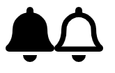
To use regular icons use the prefix ‘far’
<fa-icon [icon]="['far', 'bell']"></fa-icon>
To use solid icons use the prefix ‘fas’
<fa-icon [icon]="['fas', 'bell']"></fa-icon>
To use brand icons such as twitter,facebook etc use the prefix ‘fab’
<fa-icon [icon]="['fab', 'angular']"></fa-icon>
<fa-icon [icon]="['fab', 'twitter']"></fa-icon>
<fa-icon [icon]="['fab', 'facebook']"></fa-icon>

fontawesome brand icons
To use the pro only light icons use the prefix ‘fal’
<fa-icon [icon]="['fal', 'calendar']"></fa-icon>
In some cases we might need to add same icon from different kinds of styles.
To use same icon from multiple styles, we have to import icons using alias names as shown below.
import { faBell as farBell } from '@fortawesome/free-regular-svg-icons';
import { faBell as fasBell } from '@fortawesome/free-solid-svg-icons';

library.add(farBell, fasBell);
Now we can use bell icon in our component file as shown below
<fa-icon [icon]="['fas', 'bell']"></fa-icon>
<fa-icon [icon]="['far', 'bell']"></fa-icon>
Regular vs solid icons
Changing Font Awesome Icons color and stroke in Angular
To change the Font Awesome Icons color and stroke we can use style attribute of fa-icon selector
as shown below
<fa-icon [icon]="['fas', 'film']"
[styles]="{'stroke': 'red', 'color': 'red'}"></fa-icon>
Changing default icon style in Font Awesome Angular
To change the default icon style in Font Awesome we have to inject FaConfig and change the defaultPrefix property as shown below
The default icon style in Font Awesome is fas
import { FaConfig  } from '@fortawesome/angular-fontawesome';

export class AppComponent {

  constructor(private faConfig: FaConfig ) {
      this.faConfig.defaultPrefix = 'far';
  }

}
Font Awesome icons features
Angular Font Awesome icons comes up with useful features like
- Changing icons size
- Fixed width icons
- Rotating icons
- Mirroring icons
- Animating icons
- Adding border to the icons
- Pulled icons
- Changing default styles of icons like color and stroke
Changing size of Font Awesome icons in Angular
We can change the size of Font Awesome icons in Angular using size property of fa-icon selector.
Normally Font Awesome icons inherit the size of parent container.
By using size property we can relatively increase or decrease the size of icons with respect to the inherited font-size.
<div style="font-size:15px;color:red">
  <fa-icon [icon]="['fab', 'angular']"></fa-icon>
  <fa-icon [icon]="['fab', 'angular']" size="xs"></fa-icon>
  <fa-icon [icon]="['fab', 'angular']" size="sm"></fa-icon>
  <fa-icon [icon]="['fab', 'angular']" size="lg"></fa-icon>
  <fa-icon [icon]="['fab', 'angular']" size="2x"></fa-icon>
  <fa-icon [icon]="['fab', 'angular']" size="3x"></fa-icon>
  <fa-icon [icon]="['fab', 'angular']" size="5x"></fa-icon>
  <fa-icon [icon]="['fab', 'angular']" size="6x"></fa-icon>
  <fa-icon [icon]="['fab', 'angular']" size="7x"></fa-icon>
  <fa-icon [icon]="['fab', 'angular']" size="10x"></fa-icon>
</div>

fontawesome icon different sizes
Fixed width Font Awesome icons in Angular
Font Awesome icons contains more than 1500+ free icons and 3500+ pro icons.
But all the icons are not of same size.
To force the icons to render in a fixed size we can use fixedWidth property of <fa-icon>
This fixedWidth property is very useful when we want vertically align a series of icons in a list or navigation menu.
To understand it further I have added android, apple brand icons which are of different width and rendered them normally and with fixedWidth.
I have added background color to Font Awesome icons for visual indication of icons width.
<div style="font-size:5em">
    <fa-icon class="normal" [icon]="['fab', 'android']"></fa-icon>
    <br/>
    <fa-icon class="normal" [icon]="['fab', 'apple']"></fa-icon>
    <br/>
    <fa-icon class="fixed" [icon]="['fab', 'android']"
    [fixedWidth]="true"></fa-icon>
    <br/>
    <fa-icon class="fixed" [icon]="['fab', 'apple']"
    [fixedWidth]="true"></fa-icon>
</div>

//Adding background color to see the width of the icons

.normal{
    background-color: red;
    color:white;
}
.fixed{
    background-color: red;
    color:white;
}

fixed width fontawesome icons
As you can see, the icons rendered with fixedWidth are vertically aligned with same width
Often in our projects we might need to rotate,flip or mirror an icon depending upon the project design.
Font Awesome angular comes up with handy utilities to help us in such scenarios.
Adding border to the font awesome icons in Angular.
Using [border] property of fa-icon selector, we can add border to the font awesome icons.
<fa-icon [icon]="['fas', 'film']" [border]="true"></fa-icon>
Apply styles to the Angular font awesome icons
We can use [styles] parameter of fa-icon selector to apply our own styles.
<fa-icon [icon]="['fas', 'film']" [styles]="{'stroke': 'red', 'color': 'red'}"></fa-icon>
Rotating Font Awesome icons in Angular
We can rotate the Font Awesome icons in Angular using rotate property of <fa-icon>
<fa-icon [icon]="['fas', 'snowboarding']"></fa-icon>
<fa-icon [icon]="['fas', 'snowboarding']" rotate="90"></fa-icon>
<fa-icon [icon]="['fas', 'snowboarding']" rotate="180"></fa-icon>
<fa-icon [icon]="['fas', 'snowboarding']" rotate="270"></fa-icon>

Rotating fontawesome icons
Mirroring Font Awesome icons in Angular
We can mirror the Font Awesome icons using flip property as shown below
Allowed values for flip property are
- horizontal : mirrors icon horizontally
- vertical : mirrors icon vertically
- both : mirrors icon vertically and horizontally (requires 5.7.0 or greater)
<h3>horizontal</h3>
<fa-icon [icon]="['fas', 'snowboarding']"></fa-icon>
<fa-icon [icon]="['fas', 'snowboarding']" flip="horizontal">
</fa-icon><br/>
<h3>Vertically</h3>
<fa-icon [icon]="['fas', 'snowboarding']"></fa-icon><br/>
<fa-icon [icon]="['fas', 'snowboarding']" flip="vertical">
</fa-icon><br/>
<h3>Both Vertical and horizontal</h3>
<fa-icon [icon]="['fas', 'snowboarding']" flip="both"></fa-icon>

Mirroring fontawesome icons
Animating Font Awesome icons in Angular
One of the beautiful features of Font Awesome icons is the ability to add animation to the icons.
This feature very useful when we want to add loading or status communicating symbols.
In Font Awesome Angular we can use spin and pulse to animate the icons.
Have a look at the rotating fan icon
<fa-icon [icon]="['fas', 'fan']" [spin]="true"></fa-icon>
<fa-icon [icon]="['fas', 'fan']" [pulse]="true"></fa-icon>
And spinner and sync icons are usually used along with animations.
<fa-icon [icon]="['fas', 'spinner']" [spin]="true"></fa-icon>
<fa-icon [icon]="['fas', 'spinner']" [pulse]="true"></fa-icon>

<fa-icon [icon]="['fas', 'sync']" [spin]="true"></fa-icon>
<fa-icon [icon]="['fas', 'sync']" [pulse]="true"></fa-icon>
The real fun is we can bind the spin and pulse values to angular component variables.
As shown below
I have created a variable called isAnimated and binding it to the fa-icon spin property.
On clicking the icon Iam toggling the isAnimated value.
<fa-icon
size="5x"
[icon]="['fas', 'volleyball-ball']"
[spin]="isAnimated"
(click)="isAnimated=!isAnimated">
</fa-icon>

<fa-icon
size="5x"
[icon]="['fas', 'walking']"
[spin]="isAnimated"
(click)="isAnimated=!isAnimated">
</fa-icon>

<fa-icon
size="5x"
[icon]="['fas', 'biking']"
[spin]="isAnimated"
(click)="isAnimated=!isAnimated">
</fa-icon>

<fa-icon
size="5x"
[icon]="['fas', 'car-crash']"
[spin]="isAnimated"
(click)="isAnimated=!isAnimated">
</fa-icon>

<fa-icon
size="5x"
[icon]="['fas', 'fighter-jet']"
[spin]="isAnimated"
(click)="isAnimated=!isAnimated">
</fa-icon>
Pulled Font Awesome Icons
Usually notes and tips are wrapped around the single quotes or double quotes to give us some visual distinction.
We can use pull property of Font Awesome angular to wrap text around icons.
<fa-icon [icon]="['fas', 'quote-left']" pull="left"></fa-icon>
If You Are Working On Something That You Really Care About,
You Don’t Have To Be Pushed. The Vision Pulls You
<fa-icon [icon]="['fas', 'quote-right']" pull="right"></fa-icon>
The allowed values of pull are left,right.

fontawesome pulled icons
Transform Font Awesome icons in Angular
we can scale,position,flip and rotate icons using transform attribute of Font Awesome selector in Angular.
And further we can combine them for some beautiful effects.
To scale Font Awesome icons using transform attribute use shrink-x or grow-x. Where x is any numeric value including decimals.
<fa-icon [icon]="['fas', 'snowboarding']"></fa-icon>
<fa-icon [icon]="['fas', 'snowboarding']" transform="shrink-5">
</fa-icon>
<fa-icon [icon]="['fas', 'snowboarding']" transform="grow-5">
</fa-icon>

scaling fontawesome icons
To position the icons i.e., to move icons up, down, left, or right, use up-x, down-x, left-x, and right-x where x any numeric value, including decimals.
<fa-icon [icon]="['fas', 'snowboarding']"></fa-icon>
<fa-icon [icon]="['fas', 'snowboarding']" transform="up-5"></fa-icon>
<fa-icon [icon]="['fas', 'snowboarding']" transform="left-5"></fa-icon>
<fa-icon [icon]="['fas', 'snowboarding']" transform="down-5"></fa-icon>
<fa-icon [icon]="['fas', 'snowboarding']" transform="right-5"></fa-icon>

fontawesome position icons
Now we will combine both position and scaling as shown below.
<fa-icon [icon]="['fas', 'snowboarding']"></fa-icon>
<fa-icon [icon]="['fas', 'snowboarding']"
transform="shrink-10 up-5"></fa-icon>
<fa-icon [icon]="['fas', 'snowboarding']"
transform="shrink-10 down-5"></fa-icon>
<fa-icon [icon]="['fas', 'snowboarding']"
transform="shrink-10 left-5"></fa-icon>
<fa-icon [icon]="['fas', 'snowboarding']"
transform="shrink-10 right-5"></fa-icon>

positioning fontawesome icons
To rotate the icons using Font Awesome transform property use rotate-x. Where x is degrees to rotate and negative values also allowed.
<fa-icon [icon]="['fas', 'snowboarding']"></fa-icon>
<fa-icon [icon]="['fas', 'snowboarding']"
transform="rotate-90"></fa-icon>
<fa-icon [icon]="['fas', 'snowboarding']"
transform="rotate--90"></fa-icon>
<fa-icon [icon]="['fas', 'snowboarding']"
transform="rotate-180"></fa-icon>
<fa-icon [icon]="['fas', 'snowboarding']"
transform="rotate-270"></fa-icon>

fontawesome icons transform rotate
We can bind rotate values to our component variables to create animation effect.
Have a look at the below jumping horse animation.
<fa-icon
size="5x"
[icon]="['fas', 'horse']"
transform="rotate-{{rotation}}">
</fa-icon>
<br/>
<input type='range' min="-15" max="0"
[value]="rotation"
(input)="rotation=$event.target.value"/>
I have created a range input with minimum value as -15 and maximum value as 0. And bound it to rotation value of horse icon.
The horse icon will jump from -15 to 0 angle whenever we change the range.
To mirror or flip the icons we can use flip-h (horizontal) or flip-v (vertical) or we can use both flip-h flip-v to flip both horizontally and vertically.
<fa-icon [icon]="['fas', 'snowboarding']"></fa-icon>
<fa-icon [icon]="['fas', 'snowboarding']"
transform="flip-h"></fa-icon>
<fa-icon [icon]="['fas', 'snowboarding']"
transform="flip-v"></fa-icon>
<fa-icon [icon]="['fas', 'snowboarding']"
transform="flip-v flip-h"></fa-icon>

transform fontawesome icons flipping
We can use all of them in one transform as shown below
<fa-icon [icon]="['fas', 'snowboarding']"
transform="flip-h rotate-90 shrink-10 up-5"></fa-icon>

Transform fontawesome icons
Combine two icons using Font Awesome mask
We can combine two icons into one single color icons using mask property for fa-icon as shown below
<fa-icon [icon]="['fas', 'headphones']" transform="shrink-6"
[mask]="['fas', 'square']"></fa-icon>
<fa-icon [icon]="['fas', 'pencil-alt']" transform="shrink-6"
[mask]="['fas', 'comment']"></fa-icon>
mask icon i.e., outer icon acts like background to the actual icon as shown below.
transform property will be applied on actual icon.
In the above example headphones and pencil-alt are actual icons.
Whereas square and comment icons acts like background.

masking fontawesome icons
Layering, Text, & Counters Font Awesome icons
Font Awesome layers have some cool features like
- we can place multiple icons on top of each other.
- We can add text on top of icons.
- We can add counters to the icons.
Angular Font Awesome has a selector called fa-layers which is used to place icons on top of each other.
We will try to place twitter icon on top of square icon. To achieve this use the below code snippet
<fa-layers>
        <fa-icon [icon]="['fas', 'square']"></fa-icon>
        <fa-icon [icon]="['fab', 'twitter']"></fa-icon>
</fa-layers>
The above code first renders square icon (layer one) on top of that it will add one more layer with twitter icon.
But if you see the output you won’t see anything other than square icon because both icon layers are of same color.
So if you give some other color to the twitter icons it will be visible
<fa-layers>
    <fa-icon [icon]="['fas', 'square']"></fa-icon>
    <fa-icon [icon]="['fab', 'twitter']" style="color:yellow"></fa-icon>
</fa-layers>
Or instead of giving color you can use inverse attribute to create knock-out looking effect.
<fa-layers>
    <fa-icon [icon]="['fas', 'square']"></fa-icon>
    <fa-icon [inverse]="true" [icon]="['fab', 'twitter']" ></fa-icon>
</fa-layers>
Further we can use transform to shrink and position the twitter icon exactly middle of square icon.
<fa-layers>
    <fa-icon [icon]="['fas', 'square']"></fa-icon>
    <fa-icon [inverse]="true" [icon]="['fab', 'twitter']"
    transform="right-1 shrink-5"></fa-icon>
</fa-layers>

fontawesome icons layers
Now we will see how to combine more than two icons into one icon using Font Awesome layers
  <fa-layers>
      <fa-icon [icon]="['fas', 'play']"
       transform="rotate--90 grow-2"></fa-icon>
      <fa-icon [inverse]="true" [icon]="['fas', 'sun']"
       transform="shrink-10 up-2"></fa-icon>
      <fa-icon [inverse]="true" [icon]="['fas', 'moon']"
       transform="shrink-11 down-4.2 left-4"></fa-icon>
      <fa-icon [inverse]="true" [icon]="['fas', 'star']"
      transform="shrink-11 down-4.2 right-4"></fa-icon>
  </fa-layers>
I am placing sun,moon,star on top of rotated play icon (i.e., triangle). I have used transform property to align them properly as shown below

fontawesome multiple icons
Placing multiple icons on top of each other has several real world use cases.
For example banning cellphones and camera symbols icons.
<fa-layers>
  <fa-icon [icon]="['fas', 'camera']"
  transform="shrink-7"></fa-icon>
  <fa-icon [icon]="['fas', 'ban']" style="color:red"></fa-icon>
</fa-layers>
<br/>

<fa-layers>
  <fa-icon [icon]="['fas', 'mobile-alt']"
   transform="shrink-7"></fa-icon>
  <fa-icon [icon]="['fas', 'ban']" style="color:red"></fa-icon>
</fa-layers>

fontawesome ban icons
Adding text to Font Awesome icons in Angular
To add text to the icon we can use fa-layers-text selector inside fa-layer as shown below
Here we are adding date to the calendar icons using fa-layer-text.
<fa-layers>
    <fa-icon [icon]="['fas', 'calendar']"></fa-icon>
    <fa-layers-text content="16" style="color: white;font-weight: bold"
     transform="shrink-5 down-3"></fa-layers-text>
</fa-layers>

fontawesome icons layer text
Adding counters to Font Awesome icons in Angular
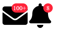
To add counters to Font Awesome icons in Angular we can use fa-layers-counter along with fa-layer.
This feature very useful while showing notification counters or email counters.
<fa-layers size="5x">
    <fa-icon [icon]="['fas', 'envelope']"></fa-icon>
    <fa-layers-counter content="100+"></fa-layers-counter>
</fa-layers>

<fa-layers size="5x">
    <fa-icon [icon]="['fas', 'bell']"></fa-icon>
    <fa-layers-counter content="8"></fa-layers-counter>
</fa-layers>
fontawesome icons layer counter
Adding custom classes to the Angular font awesome icons.
To add our own custom classes to the font awesome icons use [classes] array property of fa-icon selector.
<fa-icon [icon]="['fas', 'film']" [classes]="['custom-icon']"></fa-icon>
Stacking Angular font awesome icons.
We can stack font awesome icons using <fa-stack> tag.
<fa-stack>
    <fa-icon icon="circle" stackItemSize="2x"></fa-icon>
    <fa-icon icon="flag" [inverse]="true" stackItemSize="1x"></fa-icon>
</fa-stack>
Every <fa-icon> inside an <fa-stack> element should have stackItemSize input parameter, otherwise the icon will not render.
Angular font awesome icons StackBlitz Demo
Here is link for StackBlitz Demo
https://stackblitz.com/edit/use-font-awesome-icons-in-angular-applications
