We can create a Progress spinner in Angular using material design component mat-progress-spinner or mat-spinner.
Progress Spinner displays the progress of an ongoing process by animating the indicator along a fixed invisible circular track in a clockwise direction. i.e., mat-progress-spinner is a circular progress indicator.
mat-progress-spinner is part of angular material module called MatProgressSpinnerModule.
This tutorial contains step by step tutorial to implement progress spinner in angular by following material design specifications.
Angular Material Progress Spinner
Steps to implement Progress Spinner in Angular using material design
Step 1: Import MatProgressSpinnerModule
We can import progress spinner module in our component ts file or app.module.ts file or some common material module which can be used across the application as explained in this tutorial.
import {MatProgressSpinnerModule} from '@angular/material'
Step 2: Use mat-progress-spinner selector in component html
After importing progress spinner module. We can use one of the two selectors <mat-progress-spinner> or <mat-spinner> selector in component html file as shown below.
<mat-spinner></mat-spinner>
Step 3: Define mat-progress-spinner mode or type
We can use mat-progress-spinner in two different modes
- Determinate mode
- Indeterminate mode
mode property indicates the type of progress spinner.
<mat-progress-spinner value="100" mode="determinate">
</mat-progress-spinner>
<mat-progress-spinner mode="indeterminate"></mat-progress-spinner>
Step 4: Give progress indicator value to mat-progress-spinner
As explained above the value property of mat-progress-spinner indicates the progress of an on going process.
And it’s applicable only in ‘determinate’ mode
The property value range is from 0 to 100.
<mat-progress-spinner mode="determinate" value="50">
</mat-progress-spinner>
Step 5: Changing Progress Spinner Styles
mat-spinner has three additional properties through which we can style the progress spinner.
- diameter
- strokeWidth
- color
mat-progress-spinner example
Now we will create a progress spinner in angular using mat-progress-spinner element.
We will go through different types of examples to understand material progress spinner
mat-progress-spinner determinate mode
We will use progress spinner with determinate mode, when we can detect the process completion rate.
Process completion determined by value property of mat-progress-spinner.
If the value is 100, that means the process has been completed.
We should bind the value property to the process completion rate to animate the progress spinner.
<mat-progress-spinner mode="determinate" value=25>
</mat-progress-spinner>
<mat-progress-spinner mode="determinate" value=50>
</mat-progress-spinner>
<mat-progress-spinner mode="determinate" value=75>
</mat-progress-spinner>
<mat-progress-spinner mode="determinate" value=100>
</mat-progress-spinner>
mat progress spinner determinate mode example
Here the value is static.
value property is must, when we use determinate progress spinner, otherwise no progress indicator will be visible.
<mat-progress-spinner mode="determinate">
</mat-progress-spinner>
//No Progress Indicator as there is no value property
mat-progress-spinner indeterminate mode
When progress of an action isn’t detectable, or if it’s not necessary to indicate how long an activity will take, we will use indeterminate mode.
<mat-progress-spinner mode="indeterminate" *ngIf="IsWait">
</mat-progress-spinner>
To display the progress indicator we can use *ngIf directive.
Ones ngIf condition i.e., IsWait becomes false. Progress spinner will be removed from the DOM.
value property is ignored in this indeterminate mode.
mat-spinner vs mat-progress-spinner
You might be wondering why we have two elements mat-spinner and mat-progress-spinner.
In most of the cases we will be using progress spinner with indeterminate mode.
mat-spinner is alias for mat-progress-spinner with indeterminate mode.
i.e., the below code snippets are same.
<mat-progress-spinner mode="indeterminate">
</mat-progress-spinner>

<mat-spinner></mat-spinner>
And in mat-progress-spinner element mode property is required. otherwise no indicator will be displayed.
mode is optional in case of mat-spinner as the default mode is “indeterminate”.
<mat-progress-spinner>
</mat-progress-spinner>

//Nothing will be displayed
Changing Color of mat-progress-spinner
To change the color of mat-progress-spinner, we can use color property.
The default color is themes primary color. We can change it to accent or warn
<mat-progress-spinner mode="indeterminate" color="warn">
</mat-progress-spinner>

<mat-progress-spinner mode="indeterminate" color="accent">
</mat-progress-spinner>
mat spinner color example
Giving custom color to mat-progress-spinner
Color property accepts only default ThemePalettes or our own custom themes.
In case if you want to give custom color to mat-spinner, not color from prebiult-themes, you can override the theme CSS colors by changing circle element stroke property.
:host ::ng-deep .mat-progress-spinner circle, .mat-spinner circle {
    stroke: #0CC20C;
}
Or you can give a class name to the mat-spinner element, add the necessary CSS properties and use it wherever required.
:host ::ng-deep .custom-spinner circle{
    stroke: #0CC20C;
}

<mat-spinner class="custom-spinner"
mode="determinate" value="100"></mat-spinner>
mat spinner custom color
Changing Size of mat-spinner using diameter
The default height and width of mat-spinner is “100px”.
To change the size of mat-spinner we have to use diameter property.
For example to resize height and width of mat-spinner to “50px”. Give daimeter value as “50”
<mat-progress-spinner
mode="determinate" value="100"></mat-progress-spinner>
<mat-progress-spinner diameter="70"
mode="determinate" value="100"></mat-progress-spinner>
<mat-progress-spinner diameter="40"
mode="determinate" value="100"></mat-progress-spinner>
<mat-progress-spinner diameter="20"
mode="determinate" value="100"></mat-progress-spinner>
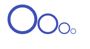
mat progress spinner size
Changing the Stroke width of progress spinner track
Usually stroke width of progress spinner track will be 10% of progress spinner diameter.
So the default stroke width of mat-spinner is “10px”
To change the stroke width of mat-progress-spinner we can use strokeWidth property.
To set stroke width to “20px”. Give “strokeWidth” value as “20”
<mat-spinner
mode="determinate" value="100"></mat-spinner>
<mat-spinner strokeWidth="50"
mode="determinate" value="100"></mat-spinner>
<mat-spinner strokeWidth="40"
mode="determinate" value="100"></mat-spinner>
<mat-spinner strokeWidth="30"
mode="determinate" value="100"></mat-spinner>
<mat-spinner strokeWidth="20"
mode="determinate" value="100"></mat-spinner>

mat progress spinner stroke width
How to Center Mat Progress Spinner
By default progress spinner will be displayed at the top-left corner of the webpage.
To center the progress spinner, set the margin of mat-spinner element to “0 auto”
<mat-spinner style="margin:0 auto;"></mat-spinner>
The above CSS code will center the progress spinner horizontally.
Mat-Progress-Spinner Overlay
In some cases, we will display a progress spinner overlay over an HTML element or entire DOM.
Follow the below steps to display mat-spinner, overlay over entire webpage.
- First center the
mat-spinnerin the middle of the webpage. - Place it inside an overlay div element
To center the progress spinner middle of the webpage. I have added a div element with the class name “center” and placed mat-spinner inside that element.
<div class="center">
    <mat-progress-spinner diameter=50
	                      mode="indeterminate"
						  color="accent">
	</mat-progress-spinner>
</div>
Added the below CSS to center the div
.center {
    position: absolute;
    top: 50%;
    left: 50%;
    -moz-transform: translateX(-50%) translateY(-50%);
    -webkit-transform: translateX(-50%) translateY(-50%);
    transform: translateX(-50%) translateY(-50%);
}
Now progress spinner will be displayed at center of the screen.
And in next step we will create an overlay <div> and place the above <div> along with mat-progress-spinner element inside that element.
<div class="overlay">
<div class="center">
    <mat-progress-spinner diameter=50
	                      mode="indeterminate"
						  color="accent">
	</mat-progress-spinner>
</div>
</div>
The below CSS overlay the div element.
.overlay{
  height:100vh;
  width:100%;
  background-color:rgba(0, 0, 0, 0.286);
  z-index:    10;
  top:        0;
  left:       0;
  position:   fixed;
}
We are setting overlay div element’s height to 100% of viewport height.
This may add scrollbar to the webpage because of default margin of body element.
To avoid scroll bar we have to set the body element margin to 0.
This should be added to global style sheet (styles.scss) file.
body{
	margin:0;
}
We might use overlay progress spinner in many places in our application.
Instead of copy pasting the above code in all places, we will create a reusable component.
Creating mat-spinner-overlay component
Using ng generate command, we will create a component called mat-spinner-overlay.
ng generate component mat-spinner-overlay
In mat-spinner-overlay.component.ts file add the below code snippet.
import { Component, OnInit, Input } from '@angular/core';

@Component({
  selector: 'app-mat-spinner-overlay',
  templateUrl: './mat-spinner-overlay.component.html',
  styleUrls: ['./mat-spinner-overlay.component.scss']
})
export class MatSpinnerOverlayComponent implements OnInit {

  constructor() { }

  @Input() value : number = 100;
  @Input() diameter: number = 100;
  @Input() mode : string ="indeterminate";
  @Input() strokeWidth : number = 10;
  @Input() overlay: boolean = false;
  @Input() color: string = "primary";

  ngOnInit() {

  }

}
I have added all input properties supported by mat-spinner component and an extra property called overlay to decide whether it’s an overlay spinner or not.
And now in mat-spinner-overlay.component.html file we will use overlay property to toggle between regular mat-progress-spinner and overlay progress spinner with the help of *ngIf and ng-template
<ng-container *ngIf="overlay;else progressSpinner">
<div class="overlay">
    <div class="center">
        <ng-template [ngTemplateOutlet]="progressSpinner"></ng-template>
    </div>
</div>
</ng-container>
<ng-template #progressSpinner>
    <mat-progress-spinner
     [diameter]="diameter"
     [mode]="mode"
     [color]="color"
     [strokeWidth]="strokeWidth"
     [value]="value">
    </mat-progress-spinner>
</ng-template>
And finally add the necessary CSS mat-spinner-overlay.component.scss file as explained above.
.center {
    position: absolute;
    top: 50%;
    left: 50%;
    -moz-transform: translateX(-50%) translateY(-50%);
    -webkit-transform: translateX(-50%) translateY(-50%);
    transform: translateX(-50%) translateY(-50%);
}

.overlay{
  height:100vh;
  width:100%;
  background-color:rgba(0, 0, 0, 0.286);
  z-index:    10;
  top:        0;
  left:       0;
  position:   fixed;
}
So to display overlay spinner use app-mat-spinner-overlay element with overlay propery true.
<app-mat-spinner-overlay overlay="true">
</app-mat-spinner-overlay>
To use regular progress spinner just use app-mat-spinner-overlay
<app-mat-spinner-overlay>
</app-mat-spinner-overlay>
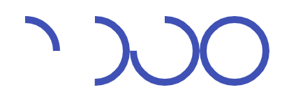
In mat-progress-spinner, animation will happen along invisible circular track.
What if we want to animate the progress on a visible circular track?
Just like twitter loading spinner as shown below
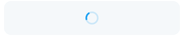
twitter loading spinner
Now we will learn how to create such progress indicator using mat-progress-spinner.
Creating loading spinner with background using mat-spinner.
If you observe the above picture there are two main elements are there
- One circular track with color opacity (which acts as background).
- Other one is animating circle.
To animate mat-progress-spinner along a fixed visible track or to load the spinner with background we can use two mat-spinner elements.
One element will act as circular track i.e., background. So we can use mat-progress-spinner with determinate mode and value as “100” to complete the circle.
Other will be regular indeterminate progress spinner element which is nothing but animating circle.
<mat-spinner class="track"
mode="determinate" value="100">
</mat-spinner>
<mat-spinner></mat-spinner>
Now we have to give opacity to circular track mat-spinner element.
So I have added stroke-opacity:0.3 CSS to mat progress spinner circle element.
:host ::ng-deep .track circle{
    stroke-opacity: 0.3 !important;
}
And finally we need to place the animating circle on top of circular track element.
The default display CSS property of mat-progress-element is “block”.
If we change it to inline they will be placed on top of each other.
So I have created an element with the class name “twitter-like” and placed both mat-spinner elements inside of it.
<div class="twitter-like">
<mat-spinner class="background"
    mode="determinate"
	value="100">
</mat-spinner>
<mat-spinner></mat-spinner>
</div>
And now we will override the default display property of both elements using .mat-progress-spinner class.
.twitter-like{
    .mat-progress-spinner{
        display: inline;
    }
}
Where to use Progress Spinners?
We can use progress spinner in two scenarios
- When it placed on the center of the screen or webpage, it indicates the initial loading of screen content.
- To represent where new content will be appeared, we can place it above or below existing content to draw the user attention.
Twitter will use circular progress spinners in above two cases.
And also in Android, the “swipe to refresh” gesture displays a circular progress indicator to represent that the UI is being refreshed.