Angular Material button module MatButtonModule(mat-button,mat-raised-button,mat-icon-button,mat-fab,mat-mini-fab) enhances the user experience of normal buttons (<button>) and anchor (<a>)tags by following Material design principles.
When you want to perform an action in webpage use button and use an anchor tag to navigate to other pages.
Buttons are placed anywhere in webpage and also places like:
- Dialogs
- Modalwindows
- Forms
- Cards
- Toolbars
Import mat button module
To import Mat Button Module use the following code.
import {MatButtonModule} from '@angular/material';
MatButtonModule contains two directives
- MatButton
- MatAnchor
MatButton Directive
MatButton Directive contains defination for material design button and exported as matButton;
And the selector is
button[mat-button], button[mat-raised-button], button[mat-icon-button],
button[mat-fab], button[mat-mini-fab], button[mat-stroked-button],
button[mat-flat-button]
MatAnchor Directive
MatAnchor directive extends MatButton contains defination for raised material design button and exported as matAnchor or matButton.
And the selector is
a[mat-button], a[mat-raised-button], a[mat-icon-button], a[mat-fab],
a[mat-mini-fab] a[mat-stroked-button] a[mat-flat-button]
Types of Angular Material Buttons
MatButtonModule comes up with seven different types of buttons. Depending upon the importance of actions.
Text buttons
- Text buttons generally used for low significant actions.
- mat-button is an example of text button
Outlined Buttons
- Outlined buttons are used for medium significant actions,outlined with border.
- The actions are important but not primary actions on the page.
- mat-stroked-button is an example of outlined button
Contained buttons
- Contained buttons have more significant than other buttons, and they are filled with color and shadow.
- And these actions are primary actions on the page.
- mat-flat-button is an example of contained button filled with color
- mat-raised-button is an example of contained button filled with color and has a shadow
Floating action buttons
- Floating action button represents the primary single most important action in a Website.
- As the name suggests It appears in front of all screen content(floating)
- It is a circular shape button with an icon in its center.
- We have three types of FABs regular, mini, and extended.
- mat-fab is a regular FAB button,mat-mini-fab is a mini FAB button.
- FAB buttons should be used for constructive actions such as create,share etc.
- FAB button should not contain regular text and icon should clearly represent the action being performed.
- FAB extended button contains text label with icon.
Button type should be given as attribute to button or anchor tag.
- mat-button (Text Button)
- mat-stroked-button (outlined button)
- mat-flat-button (Contained button with color)
- mat-raised-button (Contained button with color and shadow)
- mat-icon-button
- mat-fab (Normal floating action button)
- mat-mini-fab (Mini floating action button)
Most of the google products are developed in Angular material. One of the product is express google.
Google express uses all kinds of material buttons in its website.
mat-button example
mat-button is a simple text button generally used for less important actions. Actions like Dismiss,Learn More,Got it are usually text buttons.
<h3>mat-button example</h3>
<button mat-button>Dismiss</button>
<button mat-button>Learn More</button>
<button mat-button>Got It</button>
<a mat-button routerLink="https://www.arungudelli.com">mat-button</a>
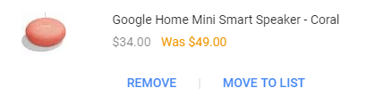
For a shopping website like Google express remoing items from shopping cart is less important action. So it uses mat-button to remove the items from cart.
mat-button example
mat-stroked-button example
mat-stroked-button is an outlined button i.e., button contains border. Generally used more important actions than text buttons.
<h3>mat-stroked-button example</h3>
<button mat-stroked-button>Add to Cart</button>
<a mat-stroked-button routerLink="https://www.arungudelli.com">
mat-stroked-button</a>
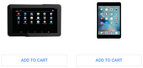
In Google express home page displays the list of products by department, with add to cart button for every product. Add to Cart button uses mat-stroked-button because all the products has same priority, Each add to card button has same importance.And this Add to cart button is not a primary action in the home page.
mat-stroked-button example
mat-flat-button example
mat-flat-button is a contained button filled with color.It should be used for primary actions in a page.
<h3>mat-flat-button example</h3>
<button mat-flat-button>mat-flat-button</button>
<a mat-flat-button routerLink="https://www.arungudelli.com">
mat-flat-button</a>
mat-raised-button example
mat-raised-button is a contained button filled with color and has shadow. And has more visibility than flat button. And we can use it in place of mat-flat-button to represent primary action in the web page.
<h3>mat-raised-button example</h3>
<button mat-raised-button>mat-raised-button</button>
<a mat-raised-button routerLink="https://www.arungudelli.com">
mat-raised-button</a>
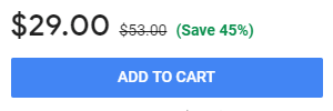
If you open the single product page in Google express,Add to cart button is primary action on the page. So it is contained button.mat-raised-button is used in this case.
mat-raised-button example
mat-icon-button example
We can use angular material icons as buttons. We need to add mat-icon-button attribute to button and use mat-icon tag to display icon.
<h3>mat-icon-button example</h3>
<button mat-icon-button><mat-icon>shopping_cart</<mat-icon>
</button>
<a mat-icon-button routerLink="https://www.arungudelli.com">
<mat-icon>love</<mat-icon></a>
In Google express website uses mat-icon-button to display the shopping cart and help buttons in top of the webpage.
<i class="material-icons">help </i><i class="material-icons">shopping_cart</i>
mat-button with icon and text example
To add the icon to mat-button text, we need to add mat-icon before the text of button as shown below
<h3>mat-button with icon and text</h3>

<button mat-raised-button color="primary">
<mat-icon>shopping_cart</mat-icon>
Add to Cart
</button>
mat-fab example
mat-fab is a regular floating action button. Generally used for most important action in the screen.
<button mat-fab>mat-fab</button>
<a mat-fab routerLink="https://www.arungudelli.com">
mat-fab</a>
Only one floating action button is recommended per screen and it should represent the single most primary action in screen. Otherwise we should not use it.
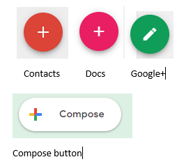
Google products like Google+,Contacts,Google docs uses floating action buttons.
Google Contacts use FAB button to add a new contact, because add contact is single most important action in the screen.
In Google docs adding a new document is the primary action, so FAB button is used.
In Google+ adding a new post button displayed at bottom right of the page which is a floating action button.
Default size of regular fab button is 56*56
As of now there is no direct way to implement FAB extended button using Angular Material. There is an open issue about this in github
mat fab buttons
New Gmalis Compose button uses extended FAB button.
mat-mini-fab example
mat-mini-fab is a floating action button with size less than regular FAB button. Should be used in small screens.
<button mat-mini-fab>mat-mini-fab</button>
<a mat-mini-fab routerLink="https://www.arungudelli.com">
mat-mini-fab</a>
mat-mini-fab size is 40*40.
mat button api
| Property | Description |
|---|---|
| color | Of type ThemePalette |
| disabled | of type boolean |
| disableRipple | of type boolean |
| isIconButton | Readonly, of type boolean |
| isRoundButton | Readonly, of type boolean |
| ripple | of type MatRipple |
mat-button color change and theming
To change the color of mat-button color use color property. We can change the background color to primary, accent, or warn.
<button mat-button color="primary">Primary</button>
mat-button disabled
To disable the mat-button we can use mat-button disabled property.
<button mat-button disabled>Disabled</button>
mat-button disableRipple
To disable the ripple animation of mat-button use disableRipple property.
<button mat-raised-button color="primary" disableRipple=true>Primary</button>
mat-button isIconButton
mat-button isIconButton property is a readonly attribute which represents whether the button is icon button.
mat-button isRoundButton
mat-button isRoundButton property is a readonly attribute which tells whether the button is FAB button i.e., rounded button.
mat-button ripple
Using ripple attribute we get the instance of MatRipple.
mat-button focus method
We can set the focus of mat-button programmatically using focus method.
In the below example mat-checkbox change event will dynamically focus the mat-button using focus button.
<mat-checkbox
(change)="changeEvent($event)"></mat-checkbox>
<br/>
<p>On Change event focuses the button</p>
<button mat-button #submitButton>Basic</button>
And in our button.component.ts file
@ViewChild('submitButton') submitButton;

changeEvent($event){
  this.submitButton.focus();
}
Angular Materials Buttons Demo
We will create new component in our project to test different types of material buttons.
export class ButtonComponent implements OnInit {
 constructor() { }
 @ViewChild('submitButton') submitButton;
 ngOnInit() {
 }
 changeEvent(){
  this.submitButton.focus();
 }
}
And the component html file is
<h3>mat-buttons examples</h3>
<div>
<button mat-button>Basic</button>
<button mat-button color="primary">Primary</button>
<button mat-button color="accent">Accent</button>
<button mat-button color="warn">Warn</button>
<button mat-button disabled>Disabled</button>
<button mat-button disableRipple=true>disableRipple</button>
</div>

<h3>mat-raised-buttons examples</h3>
<div>
<button mat-raised-button>Basic</button>
<button mat-raised-button color="primary">Primary</button>
<button mat-raised-button color="accent">Accent</button>
<button mat-raised-button color="warn">Warn</button>
<button mat-raised-button disabled>Disabled</button>
<button mat-raised-button disableRipple=true>disableRipple</button>
</div>

<h3>mat-stroked-button examples</h3>
<div>
<button mat-stroked-button>Basic</button>
<button mat-stroked-button color="primary">Primary</button>
<button mat-stroked-button color="accent">Accent</button>
<button mat-stroked-button color="warn">Warn</button>
<button mat-stroked-button disabled>Disabled</button>
<button mat-stroked-button disableRipple=true>disableRipple</button>
</div>

<h3>mat-flat-button examples</h3>
<div>
<button mat-flat-button>Basic</button>
<button mat-flat-button color="primary">Primary</button>
<button mat-flat-button color="accent">Accent</button>
<button mat-flat-button color="warn">Warn</button>
<button mat-flat-button disabled>Disabled</button>
<button mat-flat-button disableRipple=true>disableRipple</button>
</div>

<h3>mat-icon-button examples</h3>
<div>
<button mat-icon-button>
<mat-icon>shopping_cart</mat-icon>
</button>
<button mat-icon-button color="primary">
<mat-icon>shopping_cart</mat-icon>
</button>
<button mat-icon-button color="accent">
<mat-icon>shopping_cart</mat-icon>
</button>
<button mat-icon-button color="warn">
<mat-icon>shopping_cart</mat-icon>
</button>
<button mat-icon-button disabled>
<mat-icon>shopping_cart</mat-icon>
</button>
<button mat-icon-button disableRipple=true>
<mat-icon>shopping_cart</mat-icon>
</button>
</div>

<h3>mat-fab examples</h3>
<div>
<button mat-fab><mat-icon>add</mat-icon></button>
<button mat-fab color="primary"><mat-icon>add</mat-icon></button>
<button mat-fab color="accent"><mat-icon>add</mat-icon></button>
<button mat-fab color="warn"><mat-icon>add</mat-icon></button>
<button mat-fab disabled><mat-icon>add</mat-icon></button>
<button mat-fab disableRipple=true>
<mat-icon>add</mat-icon>
</button>
</div>

<h3>mat-mini-fab examples</h3>
<div>
<button mat-mini-fab><mat-icon>add</mat-icon></button>
<button mat-mini-fab color="primary"><mat-icon>add</mat-icon></button>
<button mat-mini-fab color="accent"><mat-icon>add</mat-icon></button>
<button mat-mini-fab color="warn"><mat-icon>add</mat-icon></button>
<button mat-mini-fab disabled><mat-icon>add</mat-icon></button>
<button mat-mini-fab disableRipple=true>
<mat-icon>add</mat-icon>
</button>
</div>
<h3>
Focusing
</h3>
<br/>
<mat-checkbox
(change)="changeEvent($event)"></mat-checkbox>
<br/>
<p>On Change event focuses the button</p>
<button mat-button #submitButton>Basic</button>
Here is the example demo for Angular material buttons
mat button not a known element
If you miss importing MatButtonModule from @angular/material you will get an error saying mat-button is not a know n element.
As explained in angular material tutorial it is better to create a separate module for material components. Add the required modules whenever required.